

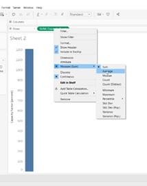
Question: Click on Sheet 1. Drag the capacity factor field (the field that was created in the pivot step) to rows. Notice that the field is
Click on Sheet 1. Drag the capacity factor field (the field that was created in the pivot step) to rows. Notice that the field is aggregated as sum. Change the sum aggregation to average by right-clicking on the field and selecting measure and then average. Drag the date field corresponding to the year that the capacity factor was measured to the columns shelf. Note the result. (Hint: examine the x-axis.)
Drag reactor and containment type to color. Change the date field to continuous (right click on the field and select continuous). Note how the graph changes. (Hint: examine the x-axis).
Question 4: How did graph change when you changed the date field to continuous. Why is it better to use the continuous field?
Sheet2 M Sheet2 MStep by Step Solution
There are 3 Steps involved in it

Get step-by-step solutions from verified subject matter experts