

Question: code using matlab 4. (20 points) The climate data for Panhandle, TX (1911-2016) is given below (source: Westem Regional Climate Center). The data is also
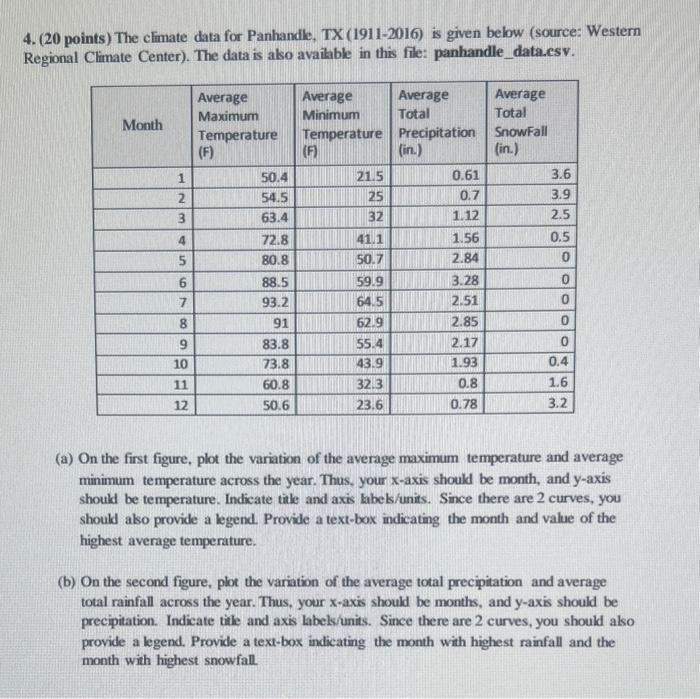
4. (20 points) The climate data for Panhandle, TX (1911-2016) is given below (source: Westem Regional Climate Center). The data is also available in this file: panhandle_data.esv. (a) On the first figure, plot the variation of the average maximum temperature and average minimum temperature across the year. Thus, your x-axis should be month, and y-axis should be temperature. Indicate tite and axis labels/units. Since there are 2 curves, you should also provide a legend. Provide a text-box indicating the month and value of the highest average temperature. (b) On the second figure, plot the variation of the average total precipitation and average total rainfall across the year. Thus, your x-axis should be months, and y-axis should be precipitation. Indicate tile and axis labels/units. Since there are 2 curves, you should also provide a legend. Provide a text-box indicating the month with highest rainfall and the month with highest snowfall
Step by Step Solution
There are 3 Steps involved in it

Get step-by-step solutions from verified subject matter experts