

Question: Compare and contrast the 3 graphs shown at the right. a). How are the graphs similar? How are they different? What is the most
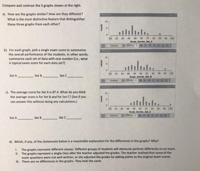
Compare and contrast the 3 graphs shown at the right. a). How are the graphs similar? How are they different? What is the most distinctive feature that distinguishes these three graphs from each other? 80 54 30 100 Exam Geores SetA b). For each graph, pick a single exam score to summarize the overall performance of the students, In other words, summarize each set of data with one number (i.e., what is typical exam score for each data set?) Citecton 10 100 Set A Set B Set C Exam Seeres Set c). The average score for Set A is 87.4. What do you think the average score is for Set 8 and for Set C? (See if you 10 can answer this without doing any calculations.) 82 84 86 Exam Seeres Set.C Set A Set B Set C d). Which, if any, of the statements below is a reasonable explanation for the differences in the graphs? Why? The graphs represent different classes. Different groups of students will obviously perform differently on an exam. 1. IL The graphs represent a single class after the teacher adjusted the grades. The teacher realized that some of the exam questions were not well written, so she adjusted the grades by adding points to the original exam scores. III. There are no differences in the graphs. They look the same.
Step by Step Solution
There are 3 Steps involved in it
To analyze the graphs and answer the questions lets go stepbystep a How are the graphs similar How a... View full answer

Get step-by-step solutions from verified subject matter experts