

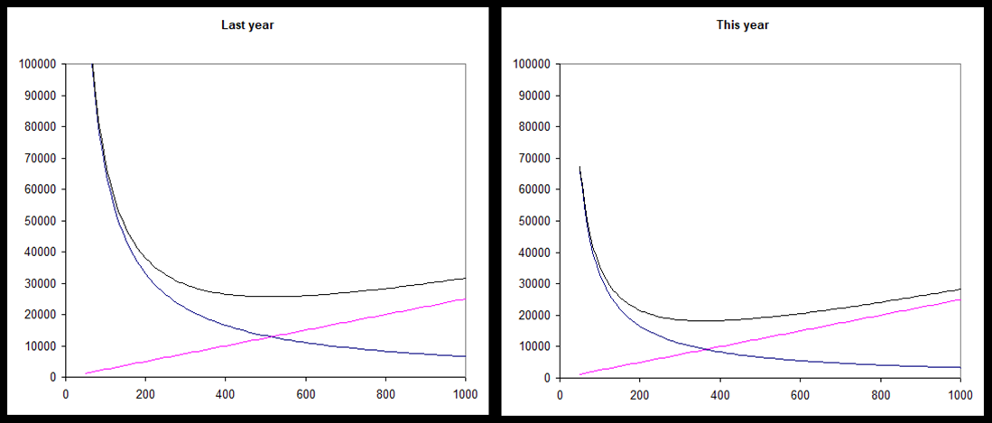
Question: Consider the above two charts that model how the inventory costs changed from last year (left pane) to this year (right pane) at company XYZ.
Consider the above two charts that model how the inventory costs changed from last year (left pane) to this year (right pane) at company XYZ.
a. Based on the examples we discussed in class what do black, blue and red line indicate? (1 point)
b. Explain the reason decrease in the blue line. (1 points)
c. If average demand remained the same during that period, where did the change most likely occur at company XYZ? (1 point)
d. Why is the intersection of blue and red lines considered as the optimal order point?
Step by Step Solution
There are 3 Steps involved in it
1 Expert Approved Answer
Step: 1 Unlock

Question Has Been Solved by an Expert!
Get step-by-step solutions from verified subject matter experts
Step: 2 Unlock
Step: 3 Unlock