

Question: Consider the following time series plot. There is obviously some type of pattern. Provisional Death Counts for Coronavirus Disease 2019 (COVID-19) By Week of Death
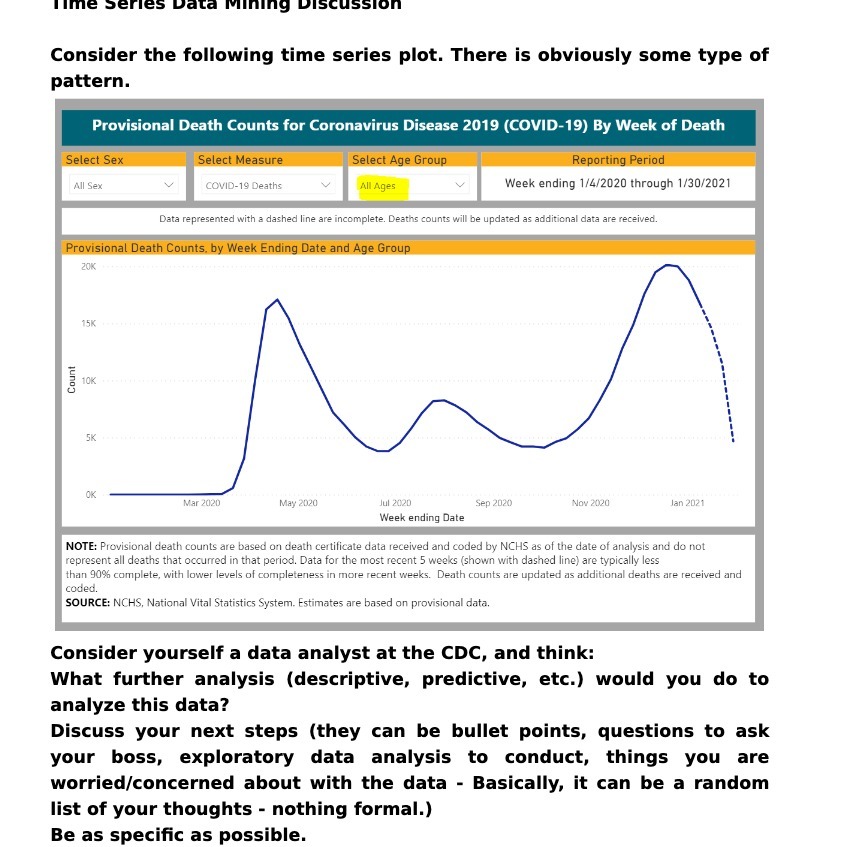
Consider the following time series plot. There is obviously some type of pattern. Provisional Death Counts for Coronavirus Disease 2019 (COVID-19) By Week of Death Select Sex Select Measure Select Age Group Reporting Period All Sex COVID-19 Deaths All Ages Week ending 1/4/2020 through 1/30/2021 Data represented with a dashed line are incomplete. Deaths counts will be updated as additional data are received. Provisional Death Counts. by Week Ending Date and Age Group 20K 15K Count 10K 5K OK Mar 2020 May 2020 Jul 2020 Sep 2020 Nov 2020 Jan 2021 Week ending Date NOTE: Provisional death counts are based on death certificate data received and coded by NCHS as of the date of analysis and do not represent all deaths that occurred in that period. Data for the most recent 5 weeks (shown with dashed line) are typically less than 90% complete, with lower levels of completeness in more recent weeks. Death counts are updated as additional deaths are received and coded. SOURCE: NCHS, National Vital Statistics System. Estimates are based on provisional data. Consider yourself a data analyst at the CDC, and think: What further analysis (descriptive, predictive, etc.) would you do to analyze this data? Discuss your next steps (they can be bullet points, questions to ask your boss, exploratory data analysis to conduct, things you are worried/concerned about with the data - Basically, it can be a random list of your thoughts - nothing formal.) Be as specific as possible
Step by Step Solution
There are 3 Steps involved in it

Get step-by-step solutions from verified subject matter experts