Question: Considerations for data visualization While data visualization is useful, and even necessary, in exploring and understanding large datasets, a variety of tables and charts are
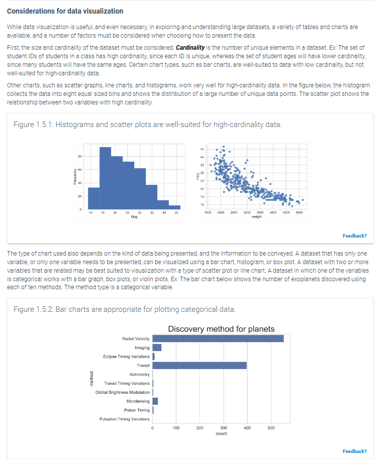
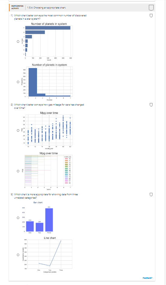
Considerations for data visualization While data visualization is useful, and even necessary, in exploring and understanding large datasets, a variety of tables and charts are available, and a number of factors must be considered when choosing how to present the data First, the size and cardinality of the dataset must be considered. Cardinality is the number of unique elements in a dataset. Ex: The set of student IDs of students in a class has high cardinality, since each ID is unique, whereas the set of student ages will have lower cardinality, since many students will have the same ages. Certain chart types, such as bar charts, are well-suited to data with low cardinality, but not well-suited for high-cardinality data. Other charts, such as scatter graphs, line charts, and histograms, work very well for high-cardinality data. In the figure below, the histogram collects the data into eight equal sized bins and shows the distribution of a large number of unique data points. The scatter plot shows the relationship between two variables with high cardinality. Figure 1.5.1: Histograms and scatter plots are well-suited for high-cardinality data. Frequency 15 10 15 20 25 35 1530 3500 4030 4530 5000 weight Feedback? The type of chart used also depends on the kind of data being presented, and the information to be conveyed. A dataset that has only one variable, or only one variable needs to be presented, can be visualized using a bar chart, histogram, or box plot. A dataset with two or more variables that are related may be best suited to visualization with a type of scatter plot or line chart. A dataset in which one of the variables is categorical works with a bar graph, box plots, or violin plots. Ex: The bar chart below shows the number of exoplanets discovered using each of ten methods. The method type is a categorical variable. Figure 1.5.2: Bar charts are appropriate for plotting categorical data. Discovery method for planets Radial Velocity Imaging Eclipse Timing Variations Transit Astrometry method Transit Timing Variations Orbital Brightness Modulation Microlensing Pulsar Timing Pulsation Timing Variations 100 300 400 500 count Feedback?PARTICIPATION ACTIVITY 1.5.4: Choosing an appropriate chart. 1) Which chart better conveys the most common number of discovered planets in a star system? Number of planets in system 20 830 Number of planets in system 500 TOO O 2) Which chart better conveys how gas mileage for cars has changed over time? Mpg over time Mpg over time II 2) Which chart is more appropriate for showing data from three unrelated categories? Bar chart Line chart O Feedback
Step by Step Solution
There are 3 Steps involved in it
1 Expert Approved Answer
Step: 1 Unlock
Question Has Been Solved by an Expert!
Get step-by-step solutions from verified subject matter experts
Step: 2 Unlock
Step: 3 Unlock
Students Have Also Explored These Related Mathematics Questions!