

Question: Construct a scatter plot using these data. Choose the correct graph below. Order Size ($) A. Suppose an Internet retailer would like to investigate
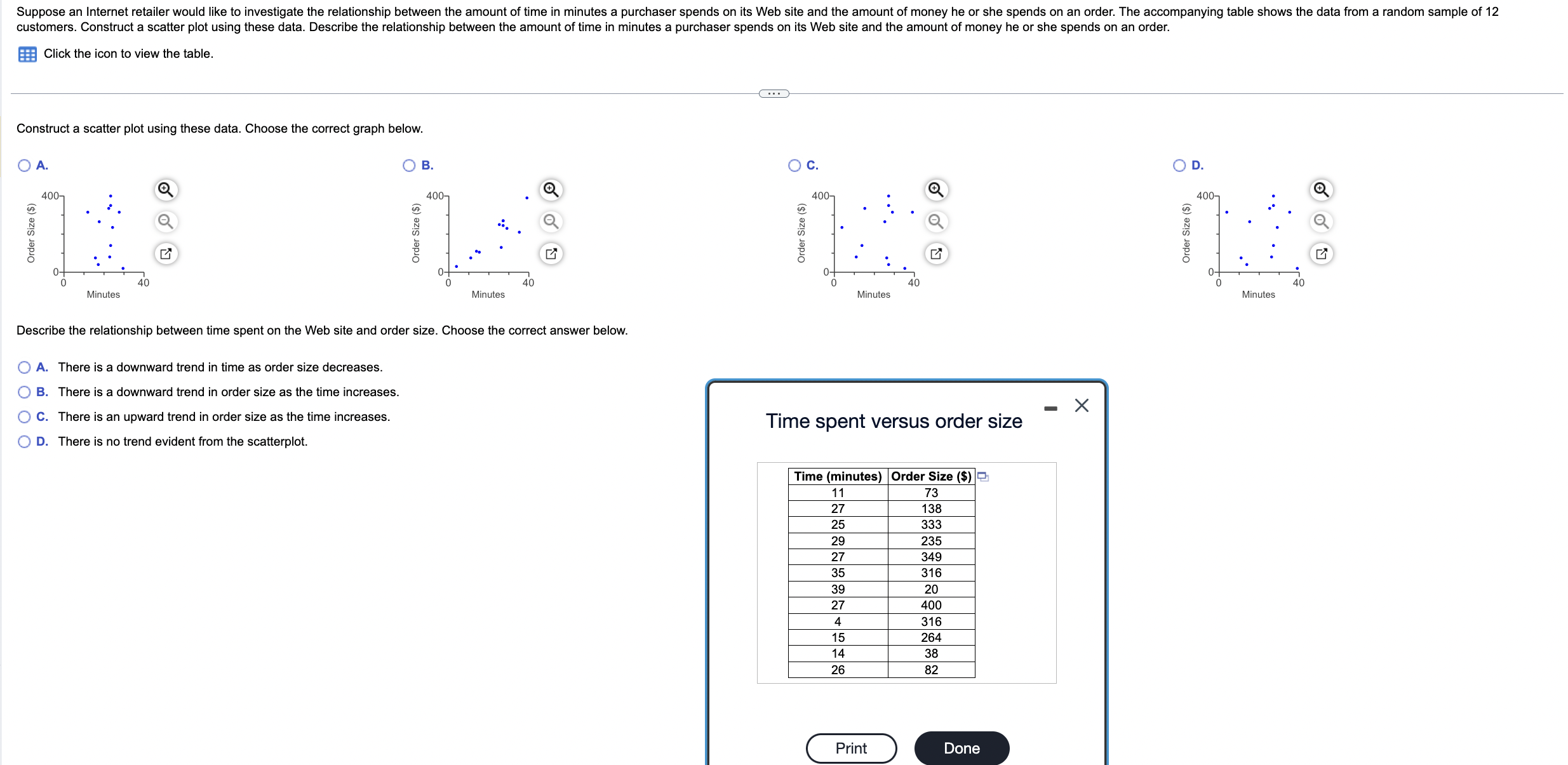

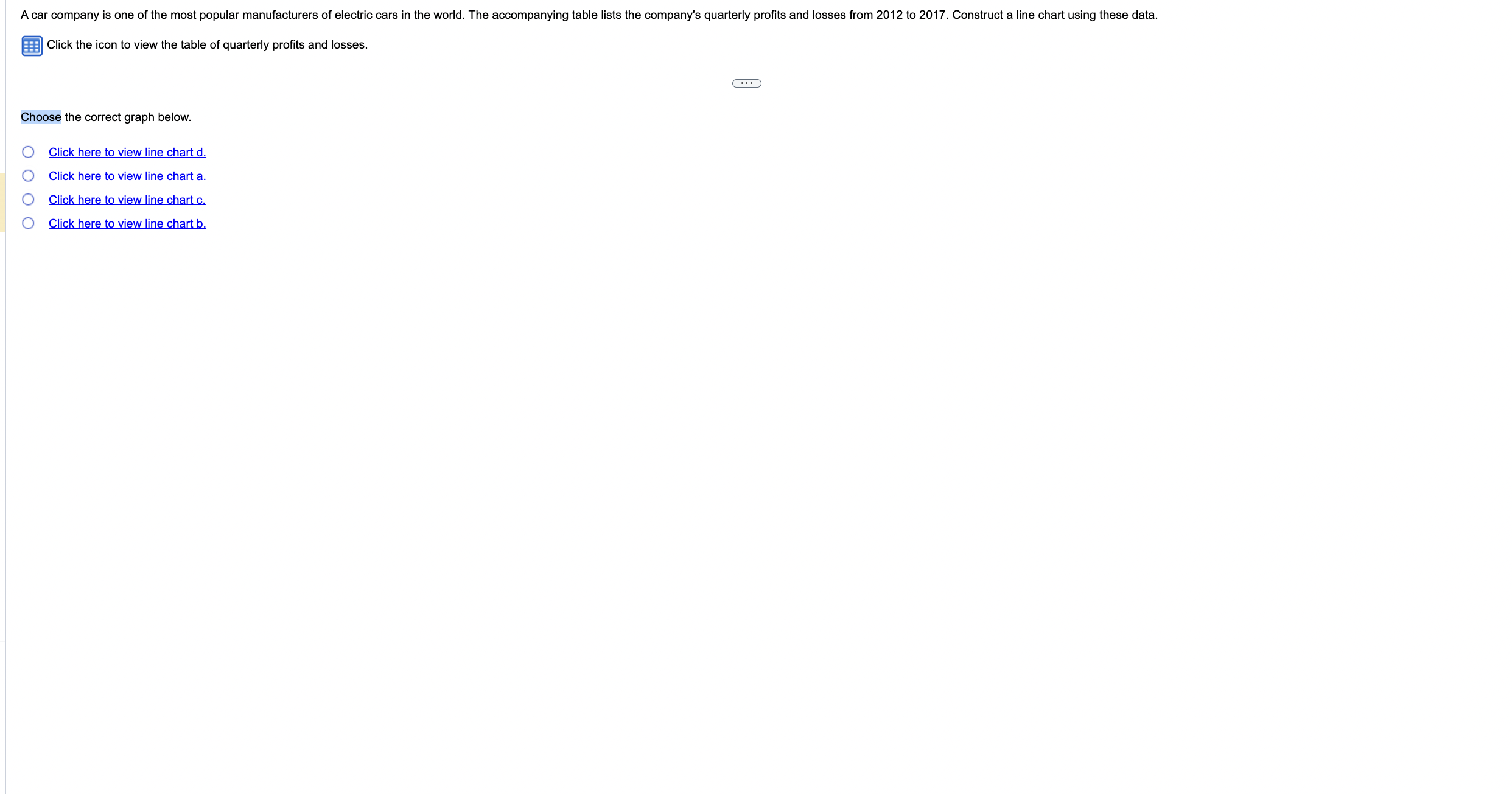
Construct a scatter plot using these data. Choose the correct graph below. Order Size ($) A. Suppose an Internet retailer would like to investigate the relationship between the amount of time in minutes a purchaser spends on its Web site and the amount of money he or she spends on an order. The accompanying table shows the data from a random sample of 12 customers. Construct a scatter plot using these data. Describe the relationship between the amount of time in minutes a purchaser spends on its Web site and the amount of money he or she spends on an order. Click the icon to view the table. 400- 0 40 Minutes Order Size ($) B. 400- 40 Minutes Describe the relationship between time spent on the Web site and order size. Choose the correct answer below. A. There is a downward trend in time as order size decreases. O B. There is a downward trend in order size as the time increases. C. There is an upward trend in order size as the time increases. D. There is no trend evident from the scatterplot. ... Order Size ($) C. 400- 40 Minutes Time spent versus order size Time (minutes) Order Size ($) 11 73 27 138 25 333 29 235 27 349 35 316 39 20 27 400 4 316 15 264 14 38 26 82 Print Done Order Size ($) D. 400- 0 40 Minutes 0 ist K Chart b 700- 500- 300- 100- -100- 2012Q1 A car company is one of the most popular manufacturers of electric cars in the world. The accompanying table lists the company's quarterly profits and losses from 2012 to 2017. Construct a line chart using these data. Click the icon to view the table of quarterly profits and losses. 2013Q1 2014Q1 2015Q1 2016Q1 2017Q1 2017Q4 Quarter Print Done Profit ($million) 700- 500- 300- 100- 2012Q1 2013Q1 -100- Chart a Profit ($million) 100 10020120201301 -300- -500- -700- 2014Q1 2015Q1 2016Q1 2017Q1 2017Q4 Quarter Print Done 2814Q1 2015 2016 21 2017Q1 2017Q4 Quarter Print Done - Chart d Quarterly Profits and Losses Profit ($million) 100- 2012Q1 201301 201401 2015Q1 201601 -100- -300- -500- -700- Quarter Print Done 2017Q1 2017Q4 Quarter 2012 ($million) 2013 ($million) 2014 ($million) 2015 ($million) 1 - 107.03 -31.27 2 - 112.88 - 38.02 -61.85 -74.27 - 182.77 -227.01 3 - 89.44 - 15.69 - 106.65 - 320.76 2016 ($million) 2017 ($million) - 293.98 22.24 - 121.57 - 334.35 -334.35 -619.31 4 11.97 - 48.85 - 153.44 -281.42 - 329.05 -675.65 Print Done - A car company is one of the most popular manufacturers of electric cars in the world. The accompanying table lists the company's quarterly profits and losses from 2012 to 2017. Construct a line chart using these data. Click the icon to view the table of quarterly profits and losses. Choose the correct graph below. 0000 Click here to view line chart d. Click here to view line chart a. Click here to view line chart c. Click here to view line chart b.
Step by Step Solution
There are 3 Steps involved in it

Get step-by-step solutions from verified subject matter experts