

Question: Continuous variable - can have any value within a given range, usually represented best using a histogram Discrete Variable - can have only whole number
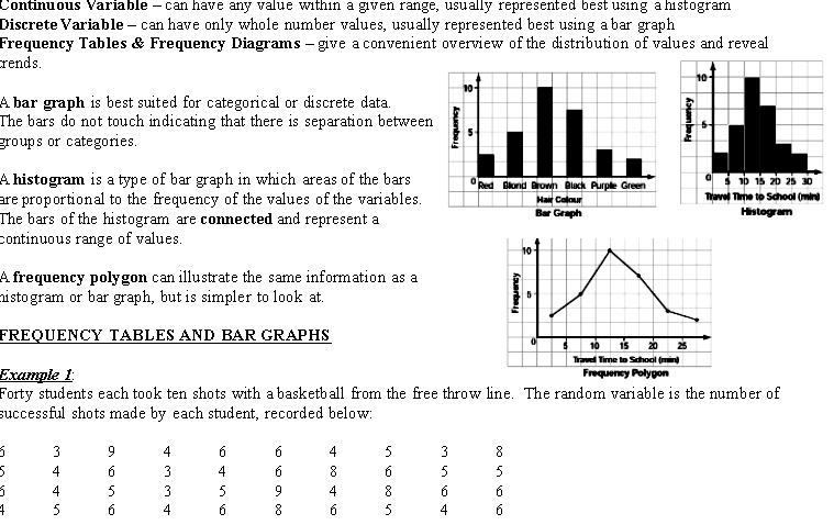
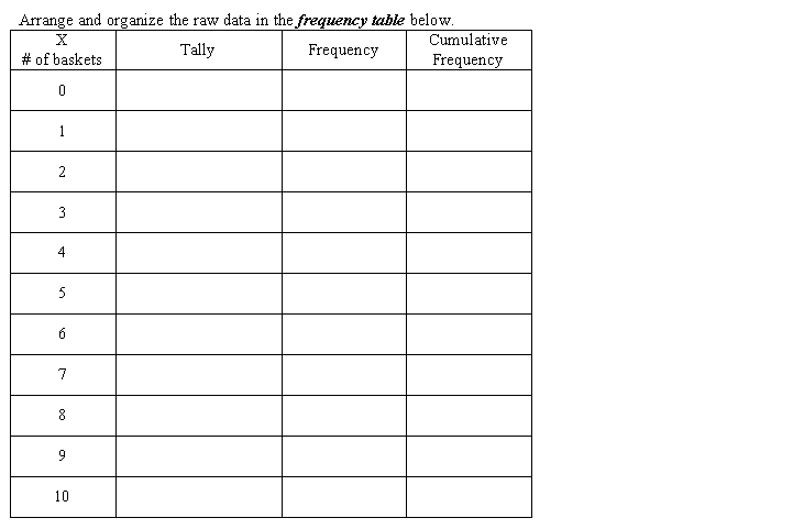
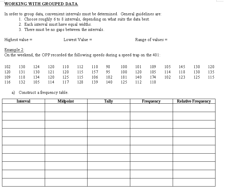
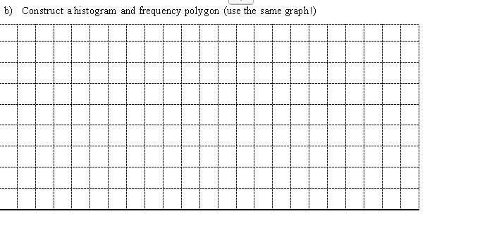
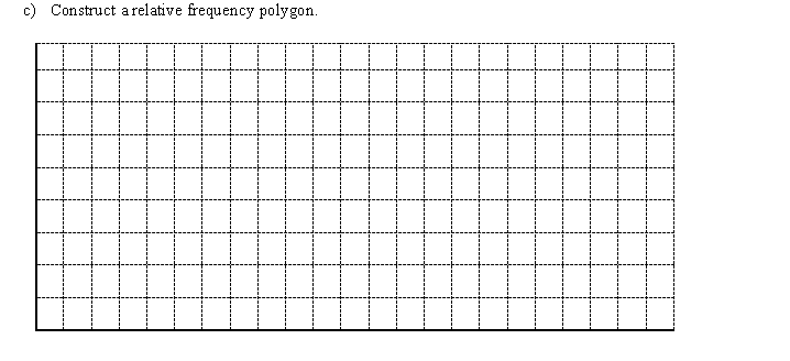
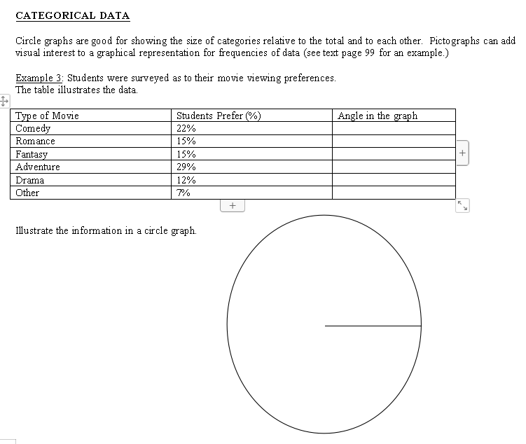
Continuous variable - can have any value within a given range, usually represented best using a histogram Discrete Variable - can have only whole number values, usually represented best using a bar graph Frequency Tables & Frequency Diagrams - give a convenient overview of the distribution of values and reveal rends. 10- 10 A bar graph is best suited for categorical or discrete data. The bars do not touch indicating that there is separation between groups or categories. A histogram is a type of bar graph in which areas of the bars Red Blond Brown Black Purple Green 0 5 10 15 20 25 30 are proportional to the frequency of the values of the variables. Hair Colour Travel Time to School (mini The bars of the histogram are connected and represent a Bar Graph Histogram continuous range of values. 10 A frequency polygon can illustrate the same information as a ustogram or bar graph, but is simpler to look at. Frequency FREQUENCY TABLES AND BAR GRAPHS 16 15 20 25 Travel Time to School (mind Example I Frequency Polygon Forty students each took ten shots with a basketball from the free throw line. The random variable is the number of successful shots made by each student, recorded below: AWWEArrange and organize the raw data in the frequency table below. X Cumulative # of baskets Tally Frequency Frequency 4 6 9 10=) Illustrate the data using a bar graph: b) Illustrate the data with a frequency polygon:\fWORKING WITH GROUPED DATA In order to group data, convenient intervals must be determined. General guidelines are: . Choose roughly 6 to 8 intervals, depending on what suits the data best. 2. Each interval must have equal widths. 3. There must be no gaps between the intervals. Highest value = Lowest Value = Range of values = Example 2: On the weekend, the OPP recorded the following speeds during a speed trap on the 401: 102 130 124 120 110 112 110 98 100 101 120 131 109 130 105 121 145 120 130 115 157 120 95 100 120 105 109 18 134 114 118 120 125 130 115 135 106 102 181 116 132 105 140 174 114 102 117 123 128 125 139 115 140 125 112 110 ) Construct a frequency table. Interval Midpoint Tally Frequency Relative Frequency\f\fCATEGORICAL DATA Circle graphs are good for showing the size of categories relative to the total and to each other. Pictographs can add visual interest to a graphical representation for frequencies of data (see text page 99 for an example.) Example 3: Students were surveyed as to their movie viewing preferences. The table illustrates the data. Type of Movie Students Prefer (9% ) Angle in the graph Comedy 22% Romance 15% Fantasy 15% + Adventure 29% Drama 12% Other 7% + Illustrate the information in a circle graph
Step by Step Solution
There are 3 Steps involved in it

Get step-by-step solutions from verified subject matter experts