

Question: Create a diagram using Excel spreadsheet to illustrate the relationship between revenue (on y-axis) and sales force (on x-axis). Revenue Sales High Sales Force Season
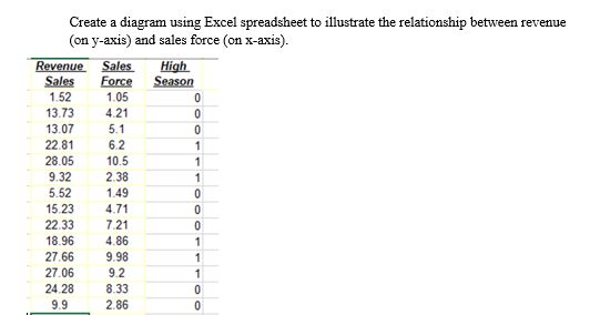

Create a diagram using Excel spreadsheet to illustrate the relationship between revenue (on y-axis) and sales force (on x-axis). Revenue Sales High Sales Force Season 1.52 1.05 13.73 4.21 13.07 5.1 22.81 6.2 28.05 10.5 9.32 2.38 5.52 1.49 15.23 4.71 22.33 7.21 18.96 4.86 27.66 9.98 27.06 92 24.28 8.33 9.9 2.86
Step by Step Solution
There are 3 Steps involved in it
1 Expert Approved Answer
Step: 1 Unlock

Question Has Been Solved by an Expert!
Get step-by-step solutions from verified subject matter experts
Step: 2 Unlock
Step: 3 Unlock