

Question: Create a pie chart for the variable insurance in excel: . Review this video to learn how to create a pie chart in excel. E
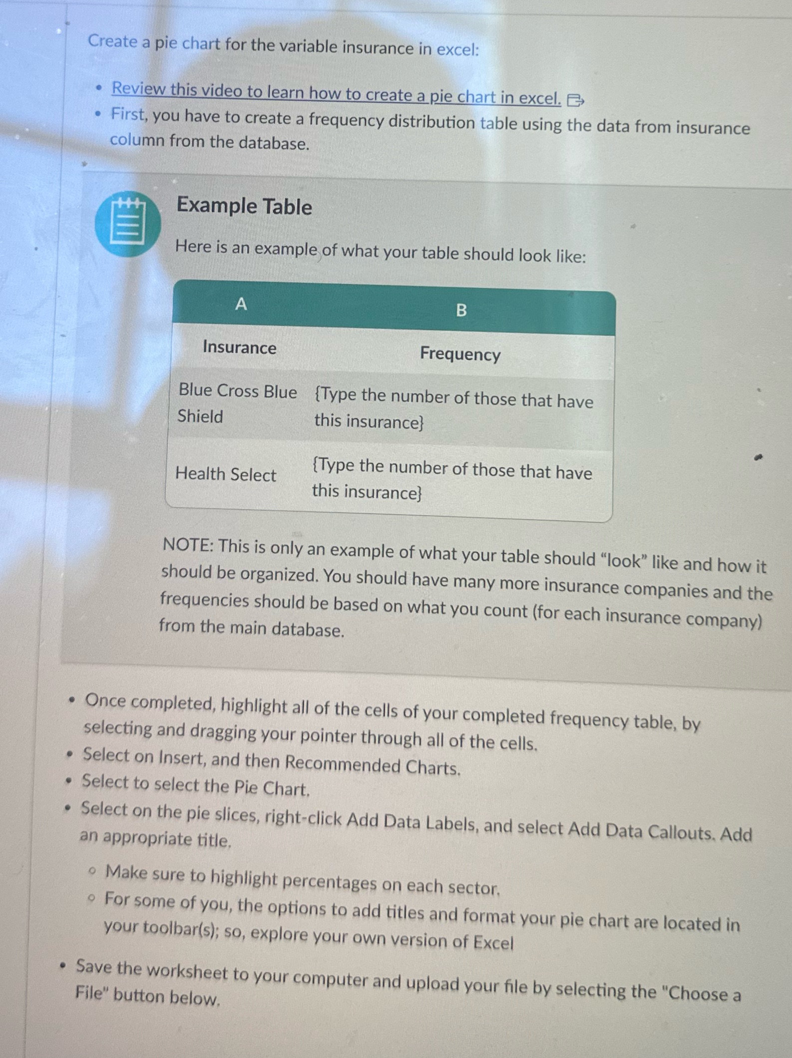
Create a pie chart for the variable insurance in excel: . Review this video to learn how to create a pie chart in excel. E . First, you have to create a frequency distribution table using the data from insurance column from the database. Example Table E Here is an example of what your table should look like: A B Insurance Frequency Blue Cross Blue {Type the number of those that have Shield this insurance} {Type the number of those that have Health Select this insurance} NOTE: This is only an example of what your table should "look" like and how it should be organized. You should have many more insurance companies and the frequencies should be based on what you count (for each insurance company) from the main database. . Once completed, highlight all of the cells of your completed frequency table, by selecting and dragging your pointer through all of the cells. . Select on Insert, and then Recommended Charts. . Select to select the Pie Chart. . Select on the pie slices, right-click Add Data Labels, and select Add Data Callouts, Add an appropriate title. Make sure to highlight percentages on each sector, . For some of you, the options to add titles and format your pie chart are located in your toolbar(s); so, explore your own version of Excel . Save the worksheet to your computer and upload your file by selecting the "Choose a File" button below
Step by Step Solution
There are 3 Steps involved in it

Get step-by-step solutions from verified subject matter experts