

Question: Create a pivot table and pivot chart to assess the sum of raw materials quantity ordered by year. 2. Create a slicer to interactively filter
Create a pivot table and pivot chart to assess the sum of raw materials quantity ordered by year.
2. Create a slicer to interactively filter the pivot chart by state from which the products were ordered.
3. Adjust the pivot chart to show horizontal bars.
Ask the Question: How can we use pivot tables and pivot charts to explore different data types?
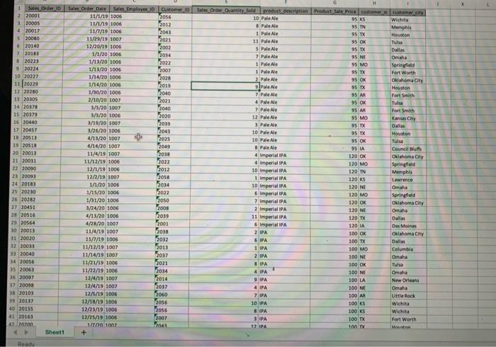
Master the Data: The dataset contains information about sales transactions to different customers. There are 132 unique
transactions, but 149 rows; this is because some of the transactions had multiple products on them.
Software needed
Excel
Screen capture tool (Windows: Snipping Tool; Mac: Cmd+Shift+4)
Data: Excel File Lab 3-4 Data.xIsx.
Perform the Analysis: Refer to Lab 3-4 in the text for instructions and steps for each of the lab parts.
Share the Story: You have explored your data using pivot charts to see how visualizing data makes it easier to interpret
Step by Step Solution
There are 3 Steps involved in it
1 Expert Approved Answer
Step: 1 Unlock

Question Has Been Solved by an Expert!
Get step-by-step solutions from verified subject matter experts
Step: 2 Unlock
Step: 3 Unlock