Question: Create pivot table and pivot chart using data from sheet named Q1. Show each county and its average observed rate of retained surgical items (avaraged
Create pivot table and pivot chart using data
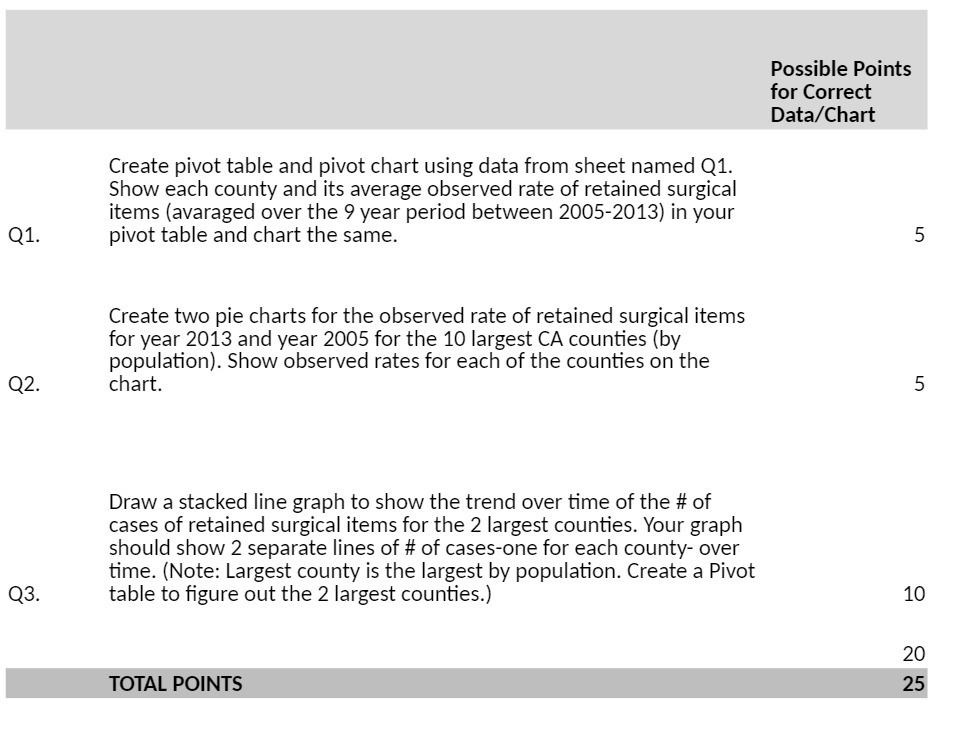
Create pivot table and pivot chart using data from sheet named Q1. Show each county and its average observed rate of retained surgical items (avaraged over the 9 year period between 2005-2013) in your Q1. pivot table and chart the same. 5 Create two pie charts for the observed rate of retained surgical items for year 2013 and year 2005 for the 10 largest CA counties (by population). Show observed rates for each of the counties on the Q2. chart. 5 Draw a stacked line graph to show the trend over time of the # of cases of retained surgical items for the 2 largest counties. Your graph should show 2 separate lines of # of cases-one for each county- over time. l(Note: Largest county is the largest by population. Create a Pivot Q3. table to gure out the 2 largest counties.) 10 20

Step by Step Solution

There are 3 Steps involved in it

1 Expert Approved Answer
Step: 1 Unlock blur-text-image
Question Has Been Solved by an Expert!

Get step-by-step solutions from verified subject matter experts

Step: 2 Unlock
Step: 3 Unlock

Students Have Also Explored These Related General Management Questions!