

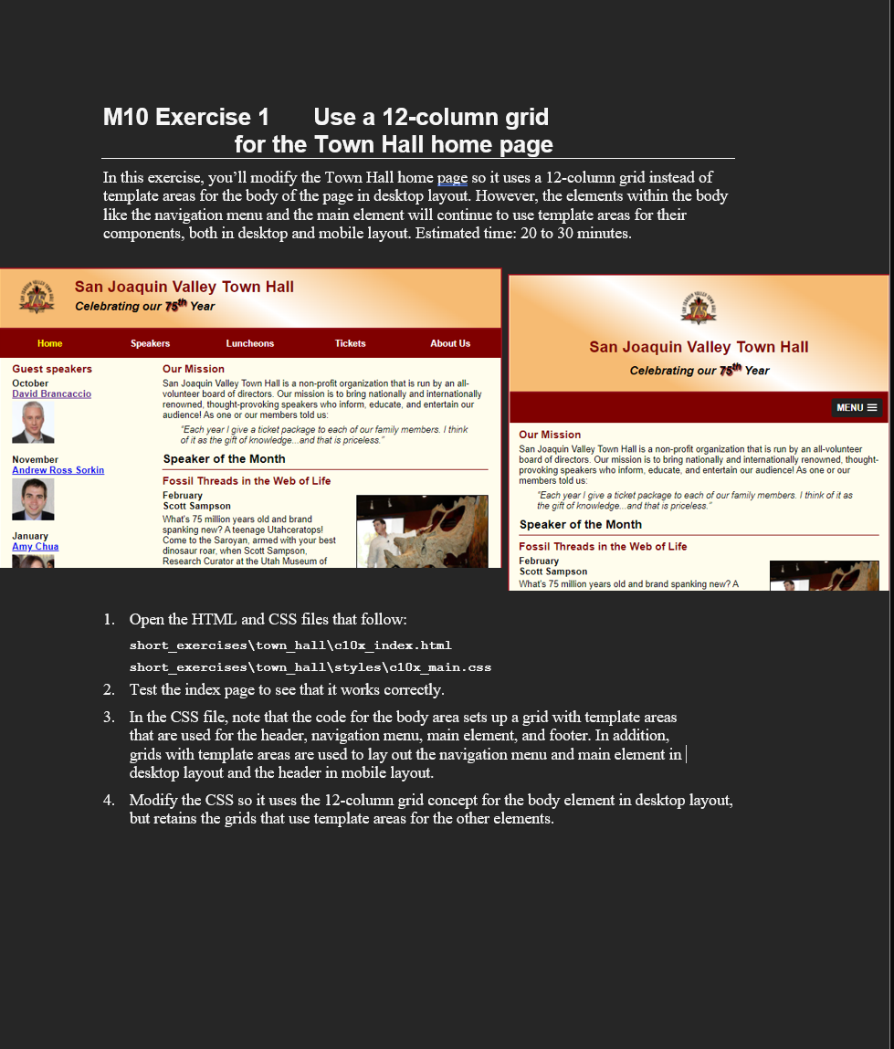
Question: CSS: / * the styles for the elements * / * { margin: 0 ; padding: 0 ; } html { background - color: white;
CSS: the styles for the elements
margin: ;
padding: ;
html
backgroundcolor: white;
body
fontfamily: Arial, Helvetica, sansserif;
fontsize: ;
width: ; changed from pixels
maxwidth: px;
margin: auto;
border: px solid #;
backgroundcolor: #fffded;
display: grid;
gridtemplate: repeat auto auto fr;
gridtemplateareas:
"head head"
"navi navi"
"main main"
"foot foot";
a:focus, a:hover
fontstyle: italic;
the styles for the header
header
padding: em em ;
borderbottom: px solid #;
backgroundimage: lineargradient
deg, #fbb #fbb white #fbb #fbb;
gridarea: head;
header h
fontsize: ;
color: #;
header h
fontsize: ;
fontstyle: italic;
header img
float: left;
padding: ;
shadow
textshadow: px px px #;
the styles for the navigation menu
#navmenu
gridarea: navi;
#navmenu ul
liststyletype: none;
margin: ;
padding: ;
display: grid;
gridtemplate: auto repeatfr;
aligncontent: center;
#navmenu ul li a
display: block;
textalign: center;
padding: em ;
textdecoration: none;
backgroundcolor: #;
color: white;
fontweight: bold;
#navmenu acurrent
color: yellow;
the styles for the main content
main
gridarea: main;
display: grid;
gridtemplate: auto auto;
gridgap: ;
gridtemplateareas:
"side sec;
the styles for the section
section
padding: px ;
gridarea: sec;
section h
fontsize: ;
padding: em em ;
margin: ;
section h
color: #;
fontsize: ;
padding: em em ;
section p
paddingbottom: em;
section blockquote
padding: em;
fontstyle: italic;
section ul
padding: em em;
liststyletype: circle;
section li
paddingbottom: em;
the styles for the article
article
padding: em ;
bordertop: px solid #;
borderbottom: px solid #;
article h
paddingtop: ;
article h
fontsize: ;
paddingbottom: em;
article img
float: right;
maxwidth: ;
minwidth: px;
margin: em em em;
border: px solid black;
the styles for the aside
aside
padding: px ;
gridarea: side;
aside h
color: #;
fontsize: ;
padding: em em ;
aside h
fontsize: ;
paddingbottom: em;
aside img
paddingbottom: em;
the styles for the footer
footer
backgroundcolor: #;
gridarea: foot;
footer p
textalign: center;
color: white;
padding: em ;
#mobilemenu
display: none;
screen widths px to px
@media only screen and maxwidth: px
section h fontsize: ;
section h aside h fontsize: ;
screen widths px to px
@media only screen and maxwidth: px
body
gridtemplate: repeat autofr;
gridtemplateareas:
"head"
"navi"
"main"
"foot";
header img float: none;
header
display: grid;
gridtemplate: repeat autofr;
gridgap: em;
textalign: center;
padding: em em ;
header img
justifyself: center;
main
gridtemplate: auto auto fr;
gridtemplateareas:
"sec"
"side";
section
margin: ;
paddingright: ;
aside
paddingright: ;
paddingleft: ;
gridrow: ;
article img maxwidth: ;
#speakers
columncount: ;
#navmenu
display: none;
#mobilemenu
display: block;
gridarea: navi;
slicknavmenu
backgroundcolor: #important;
screen widths and less
@media only screen and maxwidth: px
body fontsize: ;
Step by Step Solution
There are 3 Steps involved in it
1 Expert Approved Answer
Step: 1 Unlock

Question Has Been Solved by an Expert!
Get step-by-step solutions from verified subject matter experts
Step: 2 Unlock
Step: 3 Unlock
 Study Help