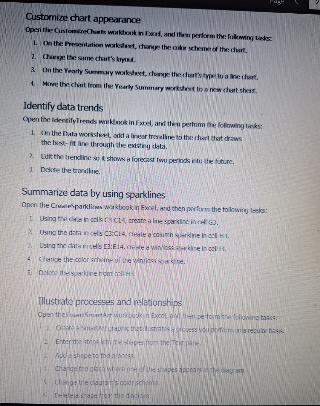
Question: Customize chart appearance Open the CustomizeCharts workbook in Excel, and then perform the following tasks: On the Presentation worksheet, change the color scheme of the
Customize chart appearance
Open the CustomizeCharts workbook in Excel, and then perform the following tasks:
On the Presentation worksheet, change the color scheme of the chart.
Change the same chart's layout.
On the Yearly Summary worksheet, change the chart's type to a line chart.
Move the chart from the Yearly Summary worksheet to a new chart sheet.
Identify data trends
Open the IdentifyTrends workbook in Excel, and then perform the following tasks:
On the Data worksheet, add a linear trendline to the chart that draws
the best fit line through the existing data.
Edit the trendline so it shows a forecast two periods into the future.
Delete the trendline.
Summarize data by using sparklines
Open the CreateSparklines workbook in Excel, and then perform the following tasks:
Using the data in cells C:C create a line sparkline in cell G
Using the data in cells : create a column sparkline in cell H
Using the data in cells E:E create a winloss sparkline in cell I
Change the color scheme of the winloss sparkline.
Delete the sparkline from cell H
Illustrate processes and relationships
Open the InsertSmartArt workbook in Excel, and then perform the following tasks:
Create a SmartArt graphic that illustrates a process you perform on a regular basis.
Enter the steps into the shapes from the Text pane.
Add a shape to the process.
Change the place where one of the shapes appears in the diagram.
Change the diagram's color scheme.
Delete a shape from the diagram.

Step by Step Solution
There are 3 Steps involved in it
1 Expert Approved Answer
Step: 1 Unlock


Question Has Been Solved by an Expert!
Get step-by-step solutions from verified subject matter experts
Step: 2 Unlock
Step: 3 Unlock


