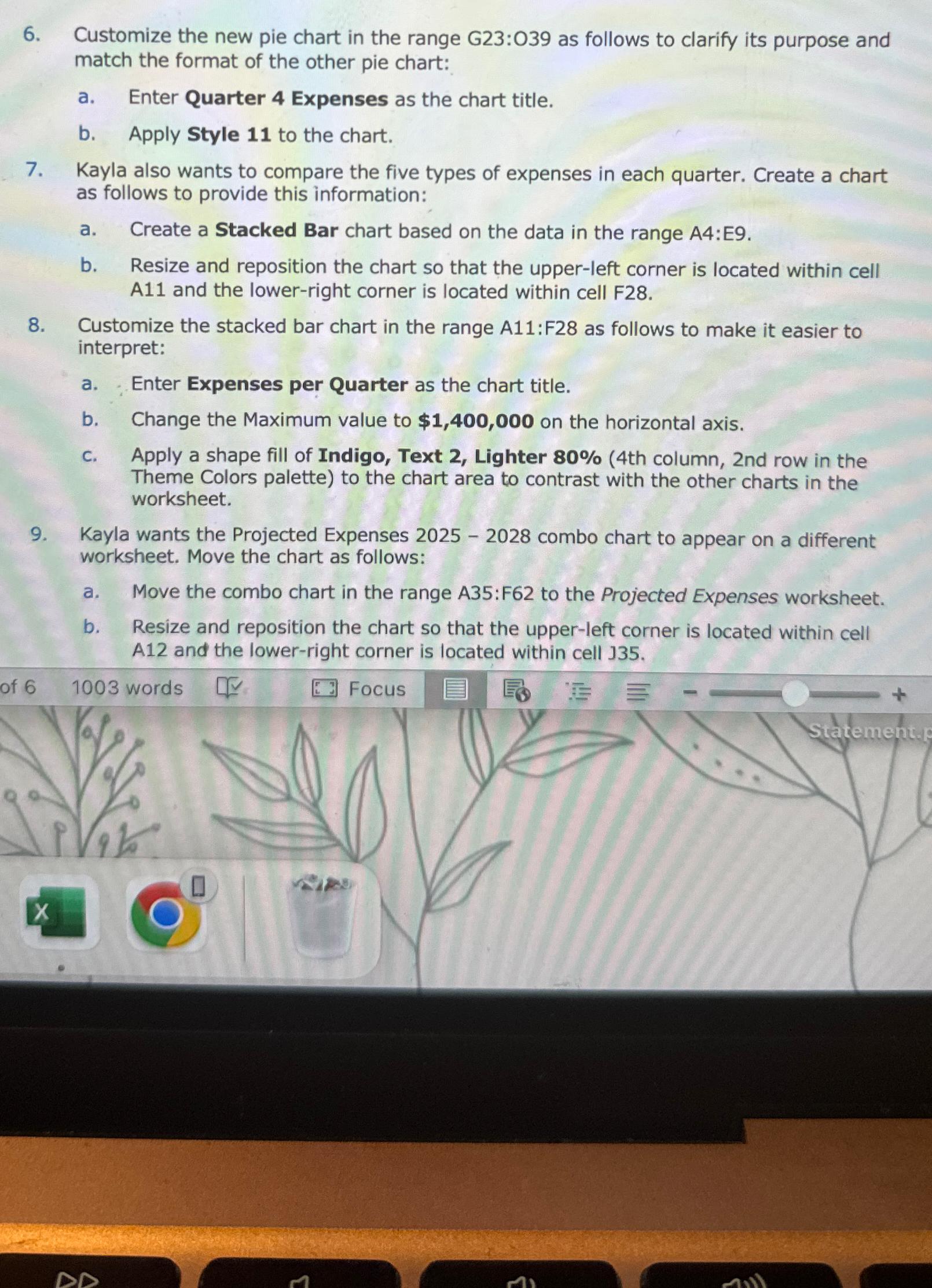
Question: Customize the new pie chart in the range G 2 3 : 0 3 9 as follows to clarify its purpose and match the format
Customize the new pie chart in the range : as follows to clarify its purpose and match the format of the other pie chart:
a Enter Quarter Expenses as the chart title.
b Apply Style to the chart.
Kayla also wants to compare the five types of expenses in each quarter. Create a chart as follows to provide this information:
a Create a Stacked Bar chart based on the data in the range A:E
b Resize and reposition the chart so that the upperleft corner is located within cell A and the lowerright corner is located within cell F
Customize the stacked bar chart in the range A:F as follows to make it easier to interpret:
a Enter Expenses per Quarter as the chart title.
b Change the Maximum value to $ on the horizontal axis.
C Apply a shape fill of Indigo, Text Lighter th column, nd row in the Theme Colors palette to the chart area to contrast with the other charts in the worksheet.
Kayla wants the Projected Expenses combo chart to appear on a different worksheet. Move the chart as follows:
a Move the combo chart in the range : to the Projected Expenses worksheet.
b Resize and reposition the chart so that the upperleft corner is located within cell A and the lowerright corner is located within cell
of
Focus

Step by Step Solution
There are 3 Steps involved in it
1 Expert Approved Answer
Step: 1 Unlock


Question Has Been Solved by an Expert!
Get step-by-step solutions from verified subject matter experts
Step: 2 Unlock
Step: 3 Unlock


