

Question: Data displays 1 Data Displays A sample of 50 11th graders were asked to select a favorite pattern out of 6 choices. The data list
Data displays
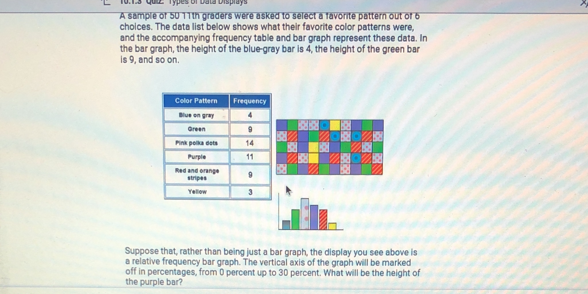
1 Data Displays A sample of 50 11th graders were asked to select a favorite pattern out of 6 choices. The data list below shows what their favorite color patterns were, and the accompanying frequency table and bar graph represent these data. In the bar graph, the height of the blue-gray bar is 4, the height of the green bar is 9, and so on. Color Pattern Frequency Blue on gray Green 9 Pink polka dots 14 Purple 11 Red and orange stripes 9 Yellow 3 Suppose that, rather than being just a bar graph, the display you see above is a relative frequency bar graph. The vertical axis of the graph will be marked off in percentages, from 0 percent up to 30 percent. What will be the height of the purple bar
Step by Step Solution
There are 3 Steps involved in it

Get step-by-step solutions from verified subject matter experts