

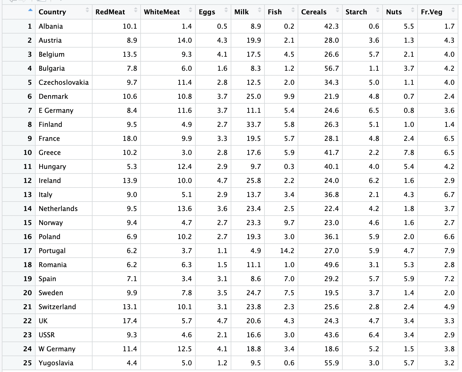
Question: Data is in percentages. Now, using this data create a stacked Bar Graph in R with Countries on the y - axis, and the percentages
Data is in percentages. Now, using this data create a stacked Bar Graph in R with Countries on the yaxis, and the percentages from different sources on the xaxis. Show full R code
Step by Step Solution
There are 3 Steps involved in it
1 Expert Approved Answer
Step: 1 Unlock

Question Has Been Solved by an Expert!
Get step-by-step solutions from verified subject matter experts
Step: 2 Unlock
Step: 3 Unlock