

Question: Data visualization is a way to communicate a particular message and interact with data to understand patterns and trends. There are many chart types available,
Data visualization is a way to communicate a particular message and interact with data to understand patterns and trends. There are many chart types available, each with its own strengths and use cases.
Following your successful graduation from The University of Queensland, you were hired as a business analyst by Agilica, Brisbane-based analytics, and a dashboarding company. Since it is May and the busy audit season is coming up, you were immediately assigned to a team that develops the end of (fiscal) year report for a major client. Agilica has great experiences with former UQ students and assumes that you are equally skilled as the other UQ graduates that they hired in the past. Hence, they want you to help develop the most appropriate visualizations for the different metrics in the annual report.
Agilica follows an agile project management approach by seeking to iteratively improve the visualizations. In a first iteration, your senior manager, Anna Frankson, has developed the following visualizations. In order to test whether the graphics are intuitively understandable, Anna asks you to match the graphics to the particular business problems. Making sure that the graphics are effective and match the business problem is important for Agilica before they let expensive designers finalize high-end graphics.
Based on what you have learnt in your business analytics course at the University of Queensland, match the most appropriate chart type for each business case provided below: (0.5 points each)
|
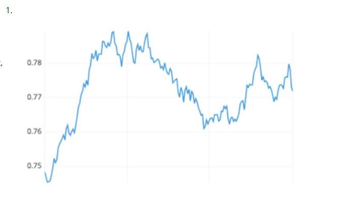
1. 0.78 0.77 0.76 0.75 wwwww
Step by Step Solution
3.39 Rating (165 Votes )
There are 3 Steps involved in it

Get step-by-step solutions from verified subject matter experts