

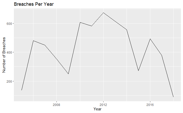
Question: Dateset: https://drive.google.com/file/d/1GFrEx4U1wPyXnfeyqorHt8DPL3evVnr7/view?usp=sharing Use ggplot2 to create a chart that shows the number of breaches that occurred each year. Your Plot should look like this including
Dateset: https://drive.google.com/file/d/1GFrEx4U1wPyXnfeyqorHt8DPL3evVnr7/view?usp=sharing
Use ggplot2 to create a chart that shows the number of breaches that occurred each year. Your Plot should look like this including the heading, and axis labels.
\f
Step by Step Solution
There are 3 Steps involved in it
1 Expert Approved Answer
Step: 1 Unlock

Question Has Been Solved by an Expert!
Get step-by-step solutions from verified subject matter experts
Step: 2 Unlock
Step: 3 Unlock