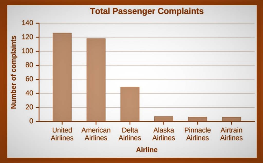
Question: Discuss how you interpreted the graph when you first saw it. What did it tell you about the data represented? Did you find it confusing?
- Discuss how you interpreted the graph when you first saw it.
- What did it tell you about the data represented?
- Did you find it confusing?
- Now, study the graph. Use your understanding of the topics Graphs, Pie Charts, and Bar Charts to interpret what is being presented.
- Compare your first impression with your second more informed interpretation and answer the following:
- Is the information presented in a biased way (that is, is it misleading?)
- What information is being misinterpreted here? How?
- What type of graph was used and was it used correctly?
- How could you correct the graph so that it more accurately represents the data?
- Discuss why someone might intentionally use a graph to mislead?

Total Passenger Complaints 140 120 100 80 Number of complaints 60 40 20 O United American Delta Alaska Pinnacle Airtrain Airlines Airlines Airlines Airlines Airlines Airlines Airline
Step by Step Solution
There are 3 Steps involved in it

Get step-by-step solutions from verified subject matter experts


