

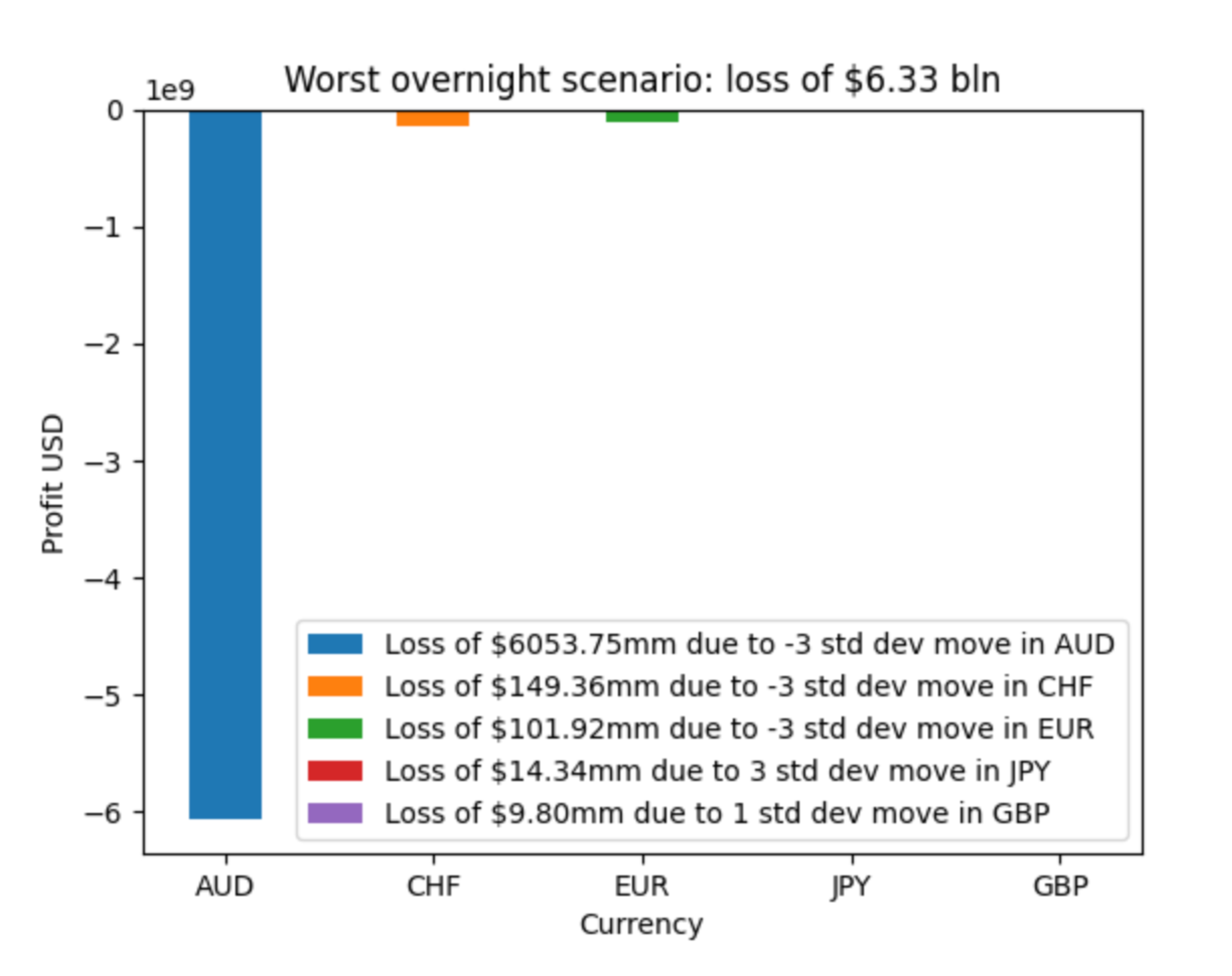
Question: Does this function work to make this graph? def plot _ scenario ( profits , moves ) : Plot a mixed -
Does this function work to make this graph?
def plotscenarioprofits moves:
Plot a mixedcolor bar chart as specified by management in PF: Data Translator Final Project.
import matplotlib.pyplot as plt
#data given
currencies AUDCHF 'EUR', JPYGBP
losses
colors blue 'orange', 'green', 'red', 'purple'
labels
'Loss of $mm due to std dev move in AUD',
'Loss of $mm due to std dev move in CHF
'Loss of $mm due to std dev move in EUR',
'Loss of $mm due to std dev move in JPY
'Loss of $mm due to std dev move in GBP
#plot
fig, ax pltsubplots
bars axbarcurrencies losses, color colors
#add legend
#bboxtoanchor positions legend outside plot
axlegendbars labels, loc 'lower center', bboxtoanchor ncol
#add title and labels
axsettitleWorst overnight scenario: loss of $ bln
axsetylabelProfit USD'
axsetxlabelCurrency
#show xaxis ticks
plttightlayout
#show plot
pltshow
Step by Step Solution
There are 3 Steps involved in it
1 Expert Approved Answer
Step: 1 Unlock

Question Has Been Solved by an Expert!
Get step-by-step solutions from verified subject matter experts
Step: 2 Unlock
Step: 3 Unlock