

Question: Draw a line graph with two axes. The x-axis represents time, starting from the opening of the rail line and extending into the future. The
Draw a line graph with two axes. The x-axis represents time, starting from the opening of the rail line and extending into the future. The y-axis represents the level of each impact, with separate lines for traffic congestion, property values, economic growth, and carbon emissions.
At the opening of the rail line (time zero on the x-axis), all lines start at a baseline level. As time progresses:
The line representing traffic congestion initially decreases, reflecting the shift from car travel to rail travel.
The line representing property values near the rail stations in Suburbia starts to rise, reflecting increased demand for these properties.
The line representing economic growth gradually increases, reflecting the increased mobility of workers and consumers.
The line representing carbon emissions initially decreases, reflecting the reduction in car travel.
This graph provides
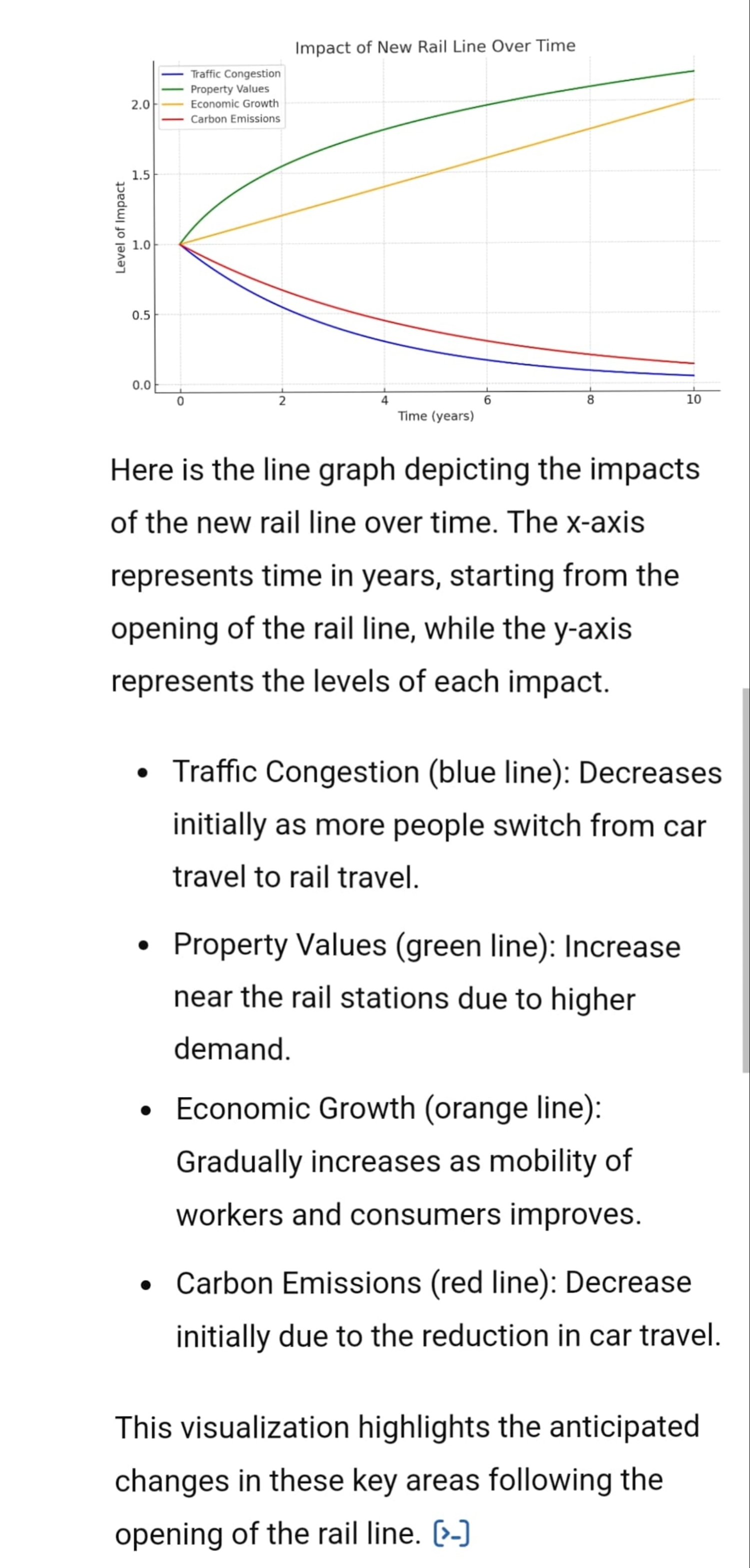
Impact of New Rail Line Over Time - Traffic Congestion - Property Values 201 Economic Growth - Carbon Emissions = w Level of Impact e o 0.5 00 | Time (years) Here is the line graph depicting the impacts of the new rail line over time. The x-axis represents time in years, starting from the opening of the rail line, while the y-axis represents the levels of each impact. Traffic Congestion (blue line): Decreases initially as more people switch from car travel to rail travel. e Property Values (green line): Increase near the rail stations due to higher demand. e Economic Growth (orange line): Gradually increases as mobility of workers and consumers improves. e Carbon Emissions (red line): Decrease initially due to the reduction in car travel. This visualization highlights the anticipated changes in these key areas following the opening of the rail line. (-]
Step by Step Solution
There are 3 Steps involved in it

Get step-by-step solutions from verified subject matter experts