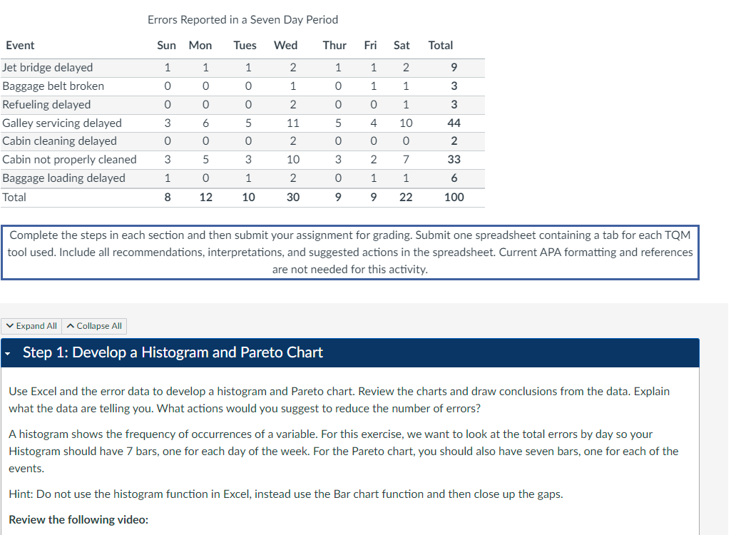
Question: Errors Reported in a Seven Day Period Continue with your examination of ways to reduce the error rate. Use the Servicing Delay vs . Support
Errors Reported in a Seven Day Period Continue with your examination of ways to reduce the error rate. Use the Servicing Delay vs Support Staff data shown below to produce
a scatter diagram comparing the galley servicing delay versus the number of staff you are short of on each respective day.
Servicing Delay vs Support Staff
Can you draw any conclusions based on the chart? Based solely on this data, what actions would you recommend to reduce the galley
servicing delay errors?
Hint: Your errors are the Galley servicing delayed and should be on the xaxis and Missing Galley Support Staff should be on the axis.
You should end up with a linear regression type line. Check out this video for some more information on building a scatter diagram: Excel
: Creating a Scatter XY Chart YouTube : Step : Create a Statistical Process Control Chart
Using the Galley Servicing Delay data and the Excel OM plugin, create a statistical process control chart SPCuse the cchart and make
sure to click on the graph box While this method is best used in manufacturing, you can apply the principles to our problem. Since the
management wants to tightly control the error rate, use a standard deviation z value of
Explain the chart and indicate whether it provided you with any additional information on ways to reduce errors and improve quality.
Also, in this case is a LCL needed? If not, why not? Step : Build a CauseandEffect Diagram
Now that you have run the data, let's look a little deeper and try to determine possible causes of the problems. Galley servicing delays
showed the highest number of problems on our original check sheet, so think about possible issues with galley servicing and produce a
causeandeffect diagram also known as a fishbone or Ishikawa diagram Use as least categories and think of several causes for each
of the categories.
Hint: Check out this video for some more information on how to create a causeandeffect diagram:
How to Create CauseandEffect Diagrams YouTube ::
Complete the steps in each section and then submit your assignment for grading. Submit one spreadsheet containing a tab for each TQM
tool used. Include all recommendations, interpretations, and suggested actions in the spreadsheet. Current APA formatting and references
are not needed for this activity.
Step : Develop a Histogram and Pareto Chart
Use Excel and the error data to develop a histogram and Pareto chart. Review the charts and draw conclusions from the data. Explain
what the data are telling you. What actions would you suggest to reduce the number of errors?
A histogram shows the frequency of occurrences of a variable. For this exercise, we want to look at the total errors by day so your
Histogram should have bars, one for each day of the week. For the Pareto chart, you should also have seven bars, one for each of the
events.
Hint: Do not use the histogram function in Excel, instead use the Bar chart function and then close up the gaps.
Review the following video:

Step by Step Solution
There are 3 Steps involved in it
1 Expert Approved Answer
Step: 1 Unlock


Question Has Been Solved by an Expert!
Get step-by-step solutions from verified subject matter experts
Step: 2 Unlock
Step: 3 Unlock


