

Image shows Tesla stock price over the last few years with S&P 500 index drawn in blue
Question:
Image shows Tesla stock price over the last few years with S&P 500 index drawn in blue on top of the chart. As you can see the price of TSLA stock was several times more volatile than the price of S&P 500 index. However, many services (such as Yahoo! Finance) (Links to an external site.)Links to an external site. Report that TSLA's beta is much less than 1.0. In other words, both services report that TSLA is LESS volatile than the market while you clearly see in the picture that it is 2 to 5 times more volatile than the market.
Question: Suppose that the services are correct (and your eyes are also correct), how do you explain this discrepancy between the volatility visible on the chart and the relatively low beta given by the data providers such as Yahoo! Finance? 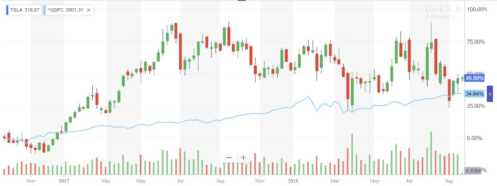
Expert Answer:
First of all you can calculate the beta of a stock yourself Just get the data for monthly returns of ... View the full answer


Fundamentals of Financial Accounting
ISBN: 978-0078025914
5th edition
Authors: Fred Phillips, Robert Libby, Patricia Libby
