

Question: ## Ex16b: Plotly-BarChart ## Objective: Create a stacked bar chart that displays the prices of various apparel categories (e.g., jeans, jackets, sweaters, etc.) in 2022
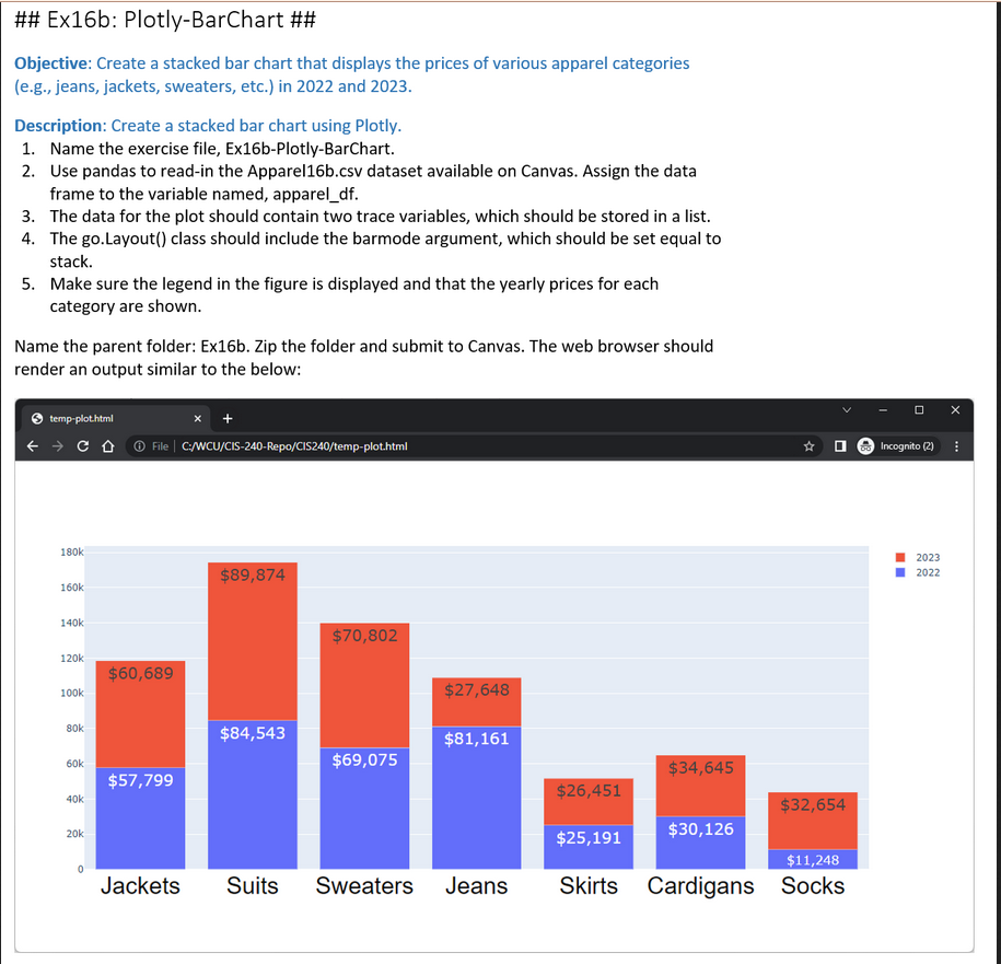
\#\# Ex16b: Plotly-BarChart \#\# Objective: Create a stacked bar chart that displays the prices of various apparel categories (e.g., jeans, jackets, sweaters, etc.) in 2022 and 2023. Description: Create a stacked bar chart using Plotly. 1. Name the exercise file, Ex16b-Plotly-BarChart. 2. Use pandas to read-in the Apparel16b.csv dataset available on Canvas. Assign the data frame to the variable named, apparel_df. 3. The data for the plot should contain two trace variables, which should be stored in a list. 4. The go.Layout() class should include the barmode argument, which should be set equal to stack. 5. Make sure the legend in the figure is displayed and that the yearly prices for each category are shown. Name the parent folder: Ex16b. Zip the folder and submit to Canvas. The web browser should render an output similar to the below
Step by Step Solution
There are 3 Steps involved in it

Get step-by-step solutions from verified subject matter experts