

Question: EXAM ONE BUS 310 Midterm Name: The table below shows the results of a 2020 study on the quality of service given at two hospitals.
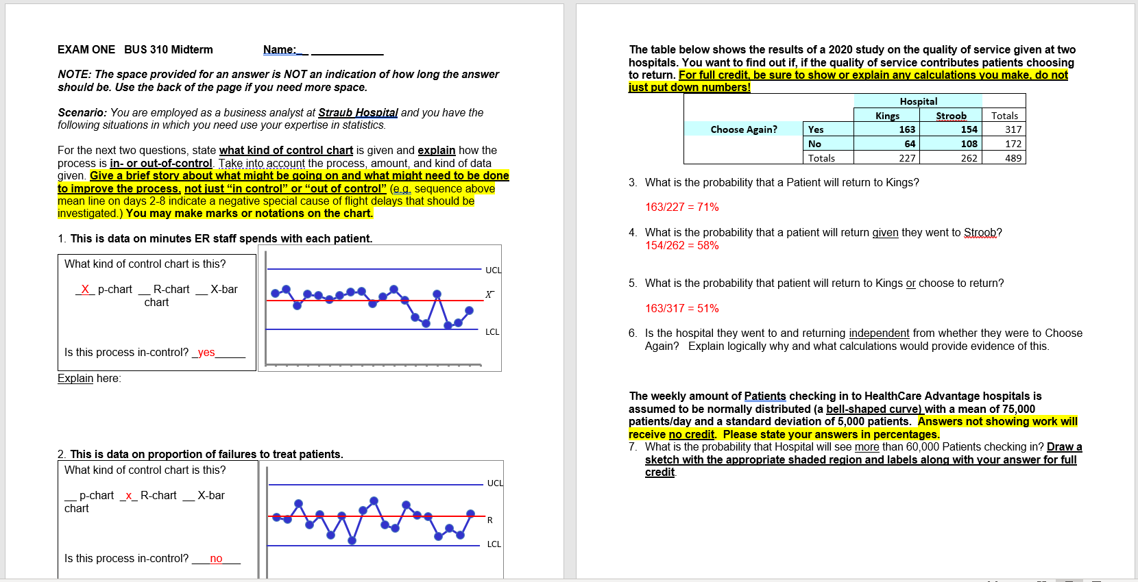

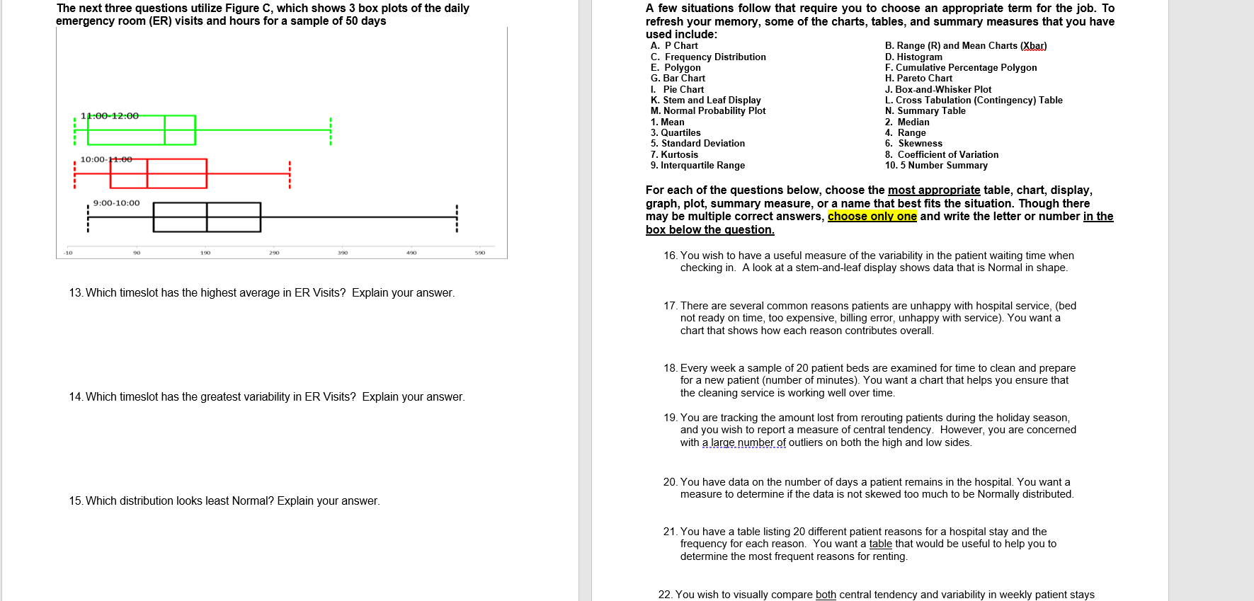

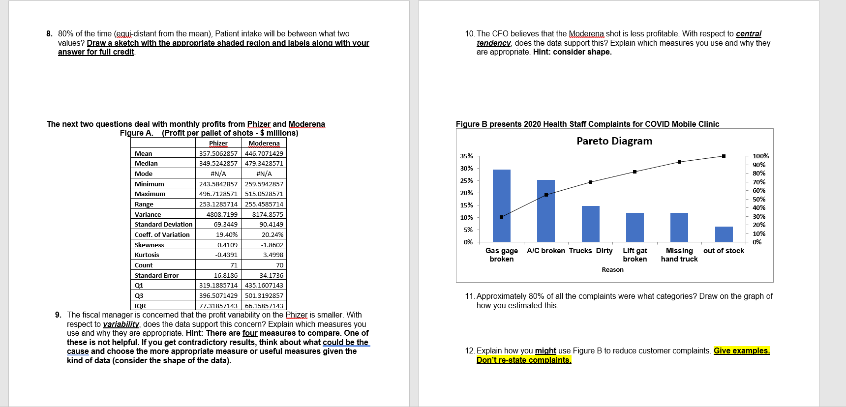


EXAM ONE BUS 310 Midterm Name: The table below shows the results of a 2020 study on the quality of service given at two hospitals. You want to find out if, if the quality of service contributes patients choosing NOTE: The space provided for an answer is NOT an indication of how long the answer to return. For full credit, be sure to show or explain any calculations you make. do not should be. Use the back of the page if you need more space. just put down numbers! Hospital Scenario: You are employed as a business analyst at Straub Hospital and you have the Kings Stroob Totals following situations in which you need use your expertise in statistics. Choose Again? Yes 163 154 317 No 64 108 172 For the next two questions, state what kind of control chart is given and explain how the Totals 227 262 489 process is in- or out-of-control. Take into account the process, amount, and kind of data given. Give a brief story about what might be going on and what might need to be done 3. What is the probability that a Patient will return to Kings? to improve the process, not just "in control" or "out of control" (e.g. sequence above mean line on days 2-8 indicate a negative special cause of flight delays that should be 163/227 = 71% investigated.) You may make marks or notations on the chart. 1. This is data on minutes ER staff spends with each patient. 4. What is the probability that a patient will return given they went to Stroob? 154/262 = 58% What kind of control chart is this? UCL X p-chart _R-chart _X-bar 5. What is the probability that patient will return to Kings or choose to return? X chart 163/317 = 51% LCL 6. Is the hospital they went to and returning independent from whether they were to Choose Is this process in-control? _yes Again? Explain logically why and what calculations would provide evidence of this. Explain here: The weekly amount of Patients checking in to HealthCare Advantage hospitals is assumed to be normally distributed (a bell-shaped curve) with a mean of 75,000 patients/day and a standard deviation of 5,000 patients. Answers not showing work will receive no credit. Please state your answers in percentages. 2. This is data on proportion of failures to treat patients. 7. What is the probability that Hospital will see more than 60,000 Patients checking in? Draw a sketch with the appropriate shaded region and labels along with your answer for full What kind of control chart is this? credit - UCL p-chart _x_R-chart _ X-bar chart R LCL Is this process in-control? no8. 80% of the time (equi-distant from the mean), Patient intake will be between what two 10. The CFO believes that the Moderena shot is less profitable. With respect to central values? Draw a sketch with the appropriate shaded region and labels along with your tendency, does the data support this? Explain which measures you use and why they answer for full credit. are appropriate. Hint: consider shape. The next two questions deal with monthly profits from Phizer and Moderena Figure B presents 2020 Health Staff Complaints for COVID Mobile Clinic Figure A. (Profit per pallet of shots - $ millions) Phizer Moderena Pareto Diagram Mean 357.5062857 446.7071429 35% 100% Median 349.5242857 479.3428571 30% 90% Mode #N/A #N/A 80% 25% Minimum 243.5842857 259.5942857 70% Maximum 496.7128571 515.0528571 20% 50% 50% Range 253.1285714 255.4585714 15% 10% Variance 1808.7199 8174.8575 10% 30% Standard Deviation 59.3449 90.4149 20% 5% Coeff. of Variation 19.40% 20.24% 10% 0% 0% Skewness 0.4109 1.8602 Gas gage A/C broken Trucks Dirty Lift gat Missing out of stock Kurtosis 0.4391 3.4998 broken broken hand truck Count Reason Standard Error 16.8186 34.1736 Q1 319.1885714 435.1607143 Q3 396.5071429 501.3192857 11. Approximately 80% of all the complaints were what categories? Draw on the graph of IQR 77.31857143 66.15857143 how you estimated this. 9. The fiscal manager is concerned that the profit variability on the Pfizer is smaller. With respect to variability, does the data support this concern? Explain which measures you use and why they are appropriate. Hint: There are four measures to compare. One of these is not helpful. If you get contradictory results, think about what could be the cause and choose the more appropriate measure or useful measures given the 12. Explain how you might use Figure B to reduce customer complaints. Give examples. kind of data (consider the shape of the data). Don't re-state complaints.The next three questions utilize Figure C, which shows 3 box plots of the daily A few situations follow that require you to choose an appropriate term for the job. To emergency room (ER) visits and hours for a sample of 50 days refresh your memory, some of the charts, tables, and summary measures that you have used include: A. P Chart B. Range (R) and Mean Charts (Xbar) C. Frequency Distribution D. Histogram E. Polygon F. Cumulative Percentage Polygon G. Bar Char H. Pareto Chart 1. Pie Chart J. Box-and-Whisker Plot K. Stem and Leaf Display L. Cross Tabulation (Contingency) Table M. Normal Probability Plot N. Summary Table 100-12:00- 1. Mean 2. Median 3. Quartiles 4. Range 5. Standard Deviation 6. Skewness 10:00-14 08- 7. Kurtosis 8. Coefficient of Variation 9. Interquartile Range 10. 5 Number Summary For each of the questions below, choose the most appropriate table, chart, display, 9:00-10:00 graph, plot, summary measure, or a name that best fits the situation. Though there may be multiple correct answers, choose only one and write the letter or number in the box below the question. 10 90 190 062 390 490 590 16. You wish to have a useful measure of the variability in the patient waiting time when checking in. A look at a stem-and-leaf display shows data that is Normal in shape. 13. Which timeslot has the highest average in ER Visits? Explain your answer. 17. There are several common reasons patients are unhappy with hospital service, (bed not ready on time, too expensive, billing error, unhappy with service). You want a chart that shows how each reason contributes overall. 18. Every week a sample of 20 patient beds are examined for time to clean and prepare for a new patient (number of minutes). You want a chart that helps you ensure that 14. Which timeslot has the greatest variability in ER Visits? Explain your answer. the cleaning service is working well over time. 19. You are tracking the amount lost from rerouting patients during the holiday season, and you wish to report a measure of central tendency. However, you are concerned with a large number of outliers on both the high and low sides. 20. You have data on the number of days a patient remains in the hospital. You want a measure to determine if the data is not skewed too much to be Normally distributed. 15. Which distribution looks least Normal? Explain your answer. 21. You have a table listing 20 different patient reasons for a hospital stay and the frequency for each reason. You want a table that would be useful to help you to determine the most frequent reasons for renting. 22. You wish to visually compare both central tendency and variability in weekly patient staysnot ready on time, too expensive, billing error, unhappy with service). You want a chart that shows how each reason contributes overall. 18. Every week a sample of 20 patient beds are examined for time to clean and prepare for a new patient (number of minutes). You want a chart that helps you ensure that 14. Which timeslot has the greatest variability in ER Visits? Explain your answer. the cleaning service is working well over time. 19. You are tracking the amount lost from rerouting patients during the holiday season, and you wish to report a measure of central tendency. However, you are concerned with a large number of outliers on both the high and low sides. 20. You have data on the number of days a patient remains in the hospital. You want a 15. Which distribution looks least Normal? Explain your answer. measure to determine if the data is not skewed too much to be Normally distributed. 21. You have a table listing 20 different patient reasons for a hospital stay and the frequency for each reason. You want a table that would be useful to help you to determine the most frequent reasons for renting. 22. You wish to visually compare both central tendency and variability in weekly patient stays before and after COVID vacines were introduced. 5 6
Step by Step Solution
There are 3 Steps involved in it

Get step-by-step solutions from verified subject matter experts