

Question: Exercise 1 We did not introduce them in the notebook, but sns . lineplot ) gives a way to plot lines charts with seaborn. [
Exercise
We did not introduce them in the notebook, but snslineplot gives a way to plot lines charts with seaborn.
#CODE HERE
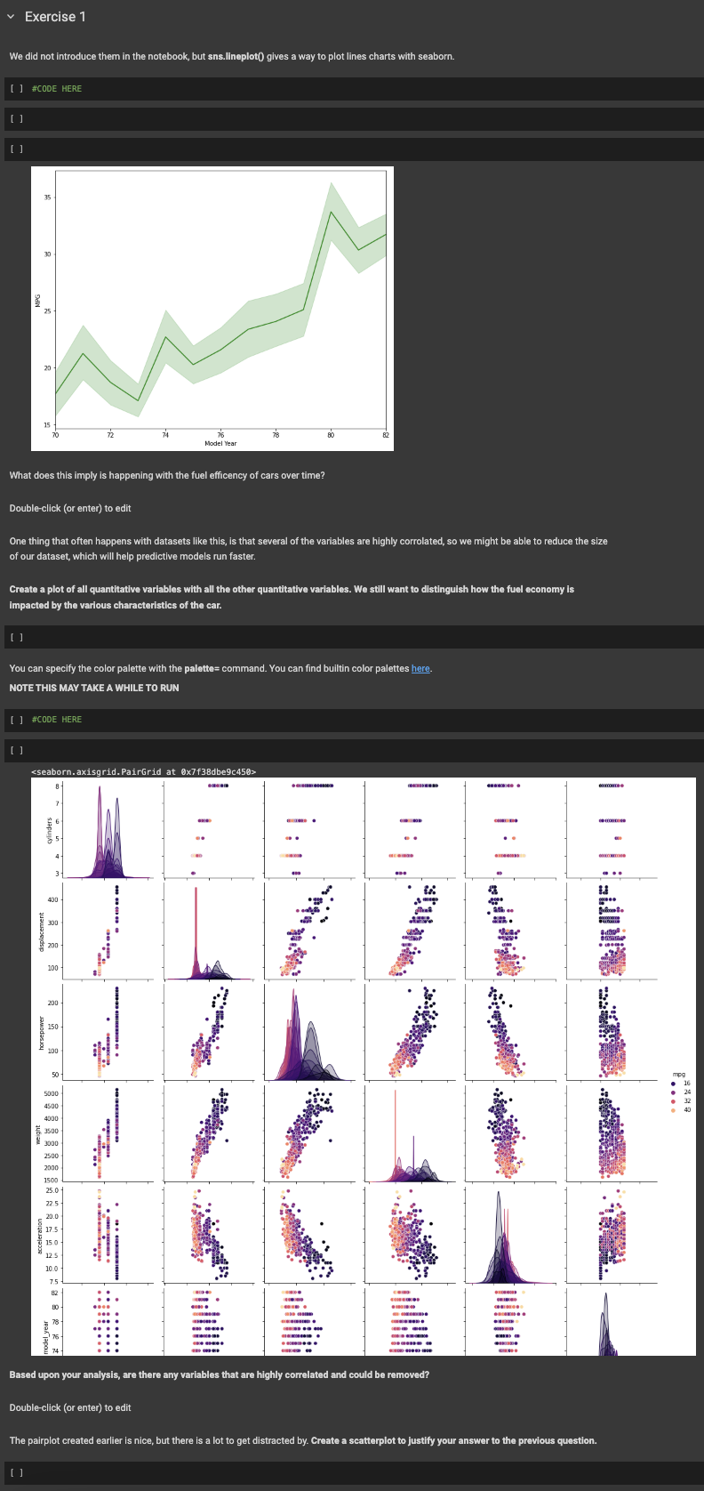
What does this imply is happening with the fuel efficency of cars over time?
Doubleclick or enter to edit
One thing that often happens with datasets like this, is that several of the variables are highly corrolated, so we might be able to reduce the size of our dataset, which will help predictive models run faster.
Create a plot of all quantitative variables with all the other quantitative variables. We still want to distinguish how the fuel economy is Impacted by the various characteristics of the car.
You can specify the color palette with the palette command. You can find builtin color palettes here.
NOTE THIS MAY TAKE A WHILE TO RUN
#CODE HERE
Based upon your analysis, are there any variables that are highly correlated and could be removed?
Doubleclick or enter to edit
The pairplot created earlier is nice, but there is a lot to get distracted by Create a scatterplot to justify your answer to the previous question.
Step by Step Solution
There are 3 Steps involved in it
1 Expert Approved Answer
Step: 1 Unlock

Question Has Been Solved by an Expert!
Get step-by-step solutions from verified subject matter experts
Step: 2 Unlock
Step: 3 Unlock