

Question: Exercise 2.11: improve this visual Imagine you work for a regional health care center and want to assess the relative success of a recent
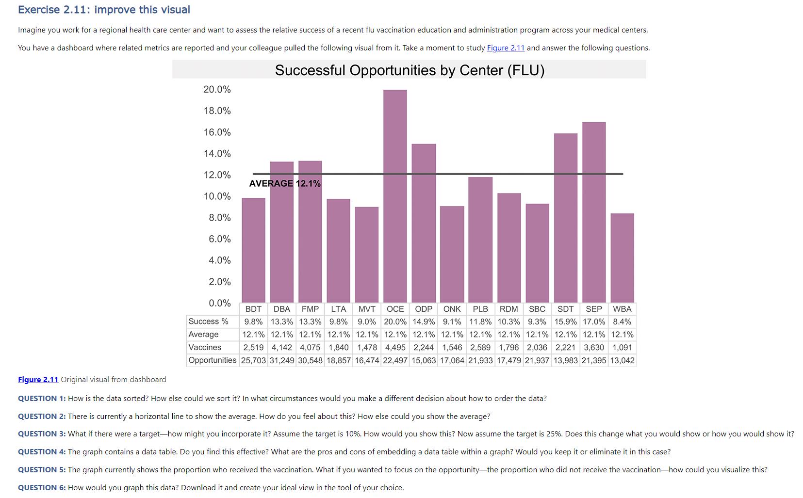
Exercise 2.11: improve this visual Imagine you work for a regional health care center and want to assess the relative success of a recent flu vaccination education and administration program across your medical centers. You have a dashboard where related metrics are reported and your colleague pulled the following visual from it. Take a moment to study Figure 2.11 and answer the following questions. Successful Opportunities by Center (FLU) Figure 2.11 Original visual from dashboard 20.0% 18.0% 16.0% 14.0% 12.0% AVERAGE 12.1% 10.0% 8.0% 6.0% 4.0% 2.0% 0.0% BDT DBA FMP LTA MVT OCE ODP ONK PLB RDM SBC SDT SEP WBA Success% 9.8% 13.3% 13.3% 9.8 % 9.0% 20.0% 14.9% 9.1% 11.8% 10.3% 9.3% 15.9% 17.0% 8.4% Average 12.1% 12.1% 12.1% 12.1% 12.1% 12.1% 12.1% 12.1% 12.1% 12.1% 12.1% 12.1% 12.1% 12.1% Vaccines 2,519 4,142 4,075 1,840 1,478 4,495 2,244 1,546 2,589 1,796 2,036 2,221 3,630 1,091 Opportunities 25,703 31,249 30,548 18,857 16,474 22,497 15,063 17,064 21,933 17,479 21,937 13,983 21,395 13,042 QUESTION 1: How is the data sorted? How else could we sort it? In what circumstances would you make a different decision about how to order the data? QUESTION 2: There is currently a horizontal line to show the average. How do you feel about this? How else could you show the average? QUESTION 3: What if there were a target-how might you incorporate it? Assume the target is 10%. How would you show this? Now assume the target is 25%. Does this change what you would show or how you would show it? QUESTION 4: The graph contains a data table. Do you find this effective? What are the pros and cons of embedding a data table within a graph? Would you keep it or eliminate it in this case? QUESTION 5: The graph currently shows the proportion who received the vaccination. What if you wanted to focus on the opportunity-the proportion who did not receive the vaccination-how could you visualize this? QUESTION 6: How would you graph this data? Download it and create your ideal view in the tool of your choice.
Step by Step Solution
There are 3 Steps involved in it

Get step-by-step solutions from verified subject matter experts