

Question: EXERCISE 7: CREATING A CLUSTERED COLUMN AND LINE CHART Charts are visual representations of data. Charts are useful because they often make it easier to
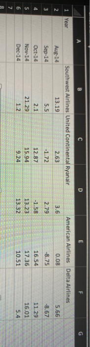
EXERCISE 7: CREATING A CLUSTERED COLUMN AND LINE CHART Charts are visual representations of data. Charts are useful because they often make it easier to understand the data because users can pick out patterns and trends that are illustrated in the chart that are otherwise difficult to see For this exercise you will analyze the changes in stock price for five different airlines. The data is provided for you. Go to the "Excel_Homework" and click on sheet labeled "Line Chart." Open the file and find the spreadsheet with Columns for each airline and Rows for each month. The data is the percent change in stock price over the course of the month. Create line charts to interpret data and answer the following questions Use the results to answer the following questions: 1. Which airline did not experience a decline in stock price? 2. What month had the highest stock price change? 3. Which airline showed the greatest change in stock prices during this period (August to December 2014)? 4. When did American airlines have a negative percent change in stock price? Type All Answers on your Excel Spreadsheet that you will submit . B C D E G 1 Year American Airlines Delta Airlines Southwest Airlines United Continental Ryanair 13.19 2.63 2 3.6 0.08 5.66 Aug-14 Sep-14 | 5.5 -1.72 2.79 -8.75 -8.67 4 -1.58 11.29 5 6 7 Oct-14 Nov-14 Dec-14 2.1 21.29 1.2 12.87 15.94 9.24 13.23 13.32 16.54 17.36 10.51 16.01 5.4 8
Step by Step Solution
There are 3 Steps involved in it

Get step-by-step solutions from verified subject matter experts