

Question: Exercise Changes in sales over time Line plots are designed to visualize the relationship between two numeric variables, where each data values is connected to
Exercise
Changes in sales over time
Line plots are designed to visualize the relationship between two
numeric variables, where each data values is connected to the next
one. They are especially useful for visualizing the change in a
number over time since each time point is naturally connected to
the next time point. In this exercise, you'll visualize the change in
avocado sales over three years.
pandas has been imported as pd and avocados is available.
Instructions
Get the total number of avocados sold on each date. The
DataFrame has two rows for each dateone for organic, and one
for conventional. Save this as nbsoldbydate
Create a line plot of the number of avocados sold.
Show the plot.
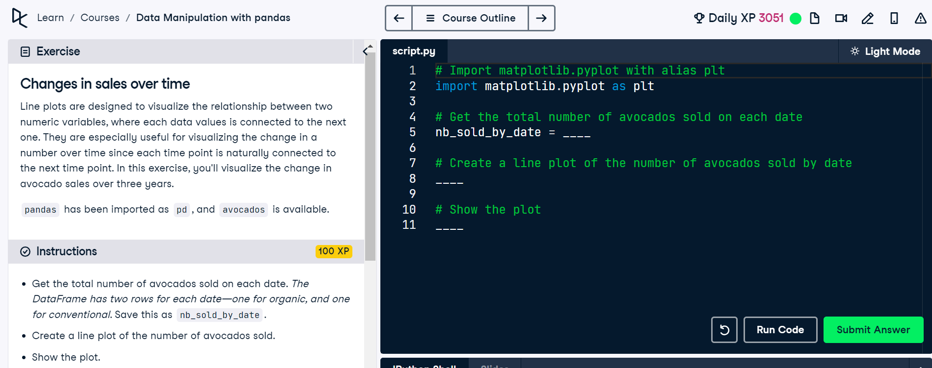
script.py
# Import matplotlib.pyplot with alias plt
import matplotlib.pyplot as plt
# Get the total number of avocados sold on each date
nbsoldbydate
# Create a line plot of the number of avocados sold by date
# Show the plot
Step by Step Solution
There are 3 Steps involved in it
1 Expert Approved Answer
Step: 1 Unlock

Question Has Been Solved by an Expert!
Get step-by-step solutions from verified subject matter experts
Step: 2 Unlock
Step: 3 Unlock