

Question: Explain what you think the chart implies to the best of your understanding.https://blogs.worldbank.org/opendata/2020-atlas-sustainable-development-goals-stories-and-insights-through-innovative-visuals Learning poverty in low- and middle-income countries varies by region Learning poor
Explain what you think the chart implies to the best of your understanding.https://blogs.worldbank.org/opendata/2020-atlas-sustainable-development-goals-stories-and-insights-through-innovative-visuals
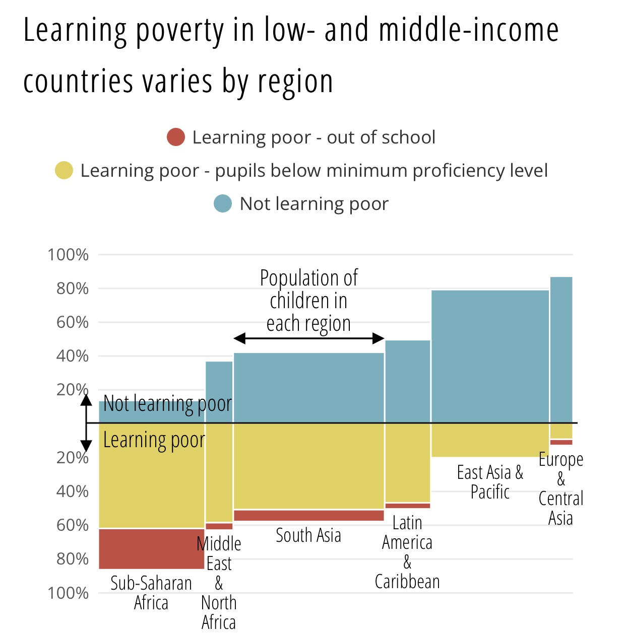
Learning poverty in low- and middle-income countries varies by region Learning poor - out of school O Learning poor - pupils below minimum proficiency level Not learning poor 100% 80% Population of children in 60% each region 40% 20% Not learning poor Learning poor 20% East Asia & Europe & 40% Pacific Central 60% Latin Asia Middle South Asia America 80% East & 100% Sub-Saharan & Caribbean Africa North Africa
Step by Step Solution
There are 3 Steps involved in it
1 Expert Approved Answer
Step: 1 Unlock

Question Has Been Solved by an Expert!
Get step-by-step solutions from verified subject matter experts
Step: 2 Unlock
Step: 3 Unlock