

Question: Figure 2 is the output from the Montecarlo simulation run for the project. The red curve is the cumulative probability while the bar chart is
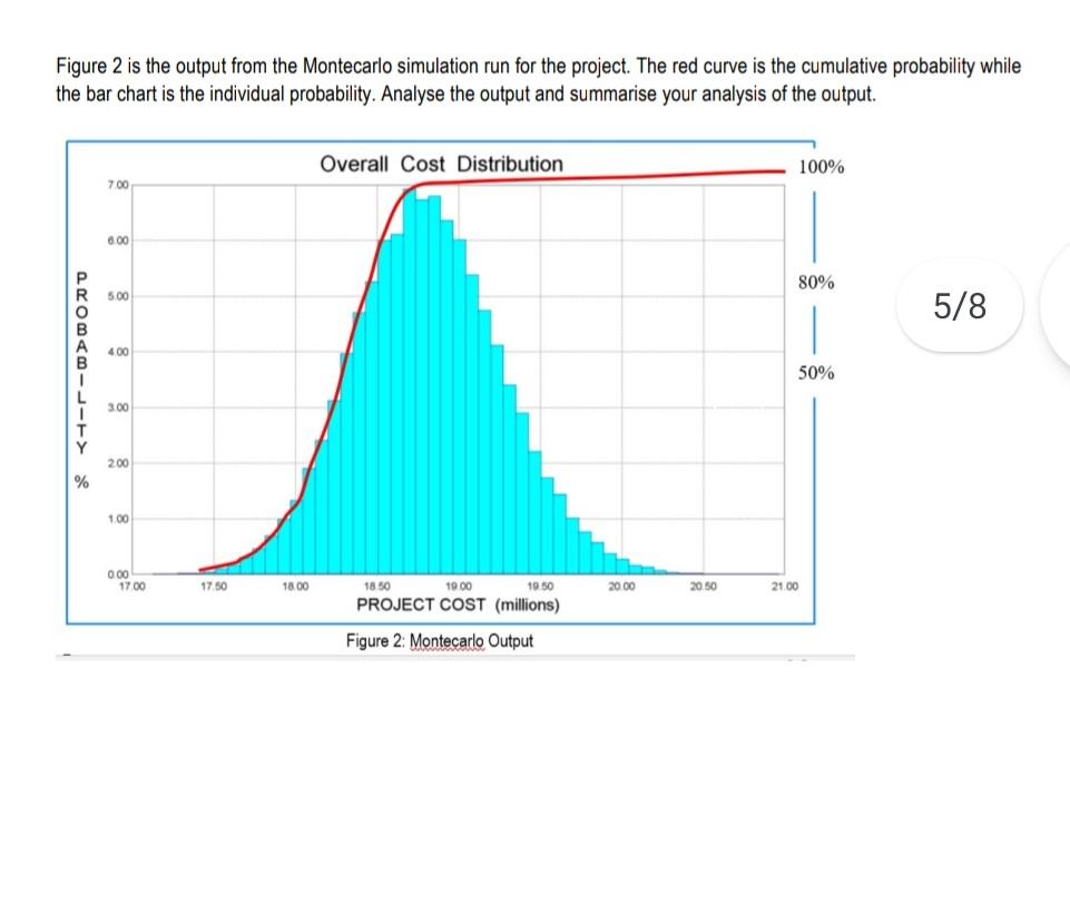
Figure 2 is the output from the Montecarlo simulation run for the project. The red curve is the cumulative probability while the bar chart is the individual probability. Analyse the output and summarise your analysis of the output. Overall Cost Distribution 100% 7.00 6.00 R 80% 5.00 5/8 400 50% 3.00 Y 200 % 100 0.00 1700 1750 18.00 18.50 2000 20.50 21.00 19.00 1950 PROJECT COST (millions) Figure 2: Montecarlo Output
Step by Step Solution
There are 3 Steps involved in it
1 Expert Approved Answer
Step: 1 Unlock

Question Has Been Solved by an Expert!
Get step-by-step solutions from verified subject matter experts
Step: 2 Unlock
Step: 3 Unlock