

Question: For example, plot _ noon _ elevations _ over _ year ( - 4 3 . 5 2 5 6 5 ) should display a
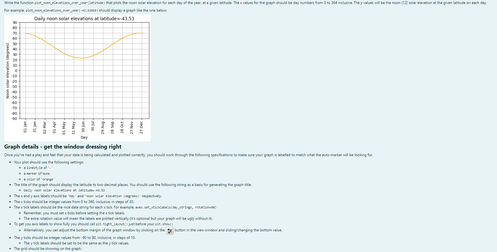
For example, plotnoonelevationsoveryear should display a graph like the one below:
Graph details get the window dressing right
Your plot should use the following settings:
a linestyle of
a marker of None.
a color of 'orange'
The title of the graph should display the latitude to two decimal places. You should use the following string as a basis for generating the graph title:
Daily noon solar elevations at latitude
The and axis labels should be 'Day' and 'Noon solar elevation degrees respectively.
The ticks should be integer values from to inclusive, in steps of
The tick labels should be the nice date string for each tick. For example, axes.setxticklabelsdaystrings, rotation
Remember, you must set ticks before setting the tick labels.
The extra rotation value will mean the labels are printed vertically its optional but your graph will be ugly without it
To get you axis labels to show fully you should call plttightlayout just before your pltshow
Alternatively, you can adjust the bottom margin of the graph window by clicking on the button in the view window and slidingchanging the bottom value.
The ticks should be integer values from to inclusive, in steps of
The tick labels should be set to be the same as the tick values.
The grid should be showing on the graph.
Step by Step Solution
There are 3 Steps involved in it
1 Expert Approved Answer
Step: 1 Unlock

Question Has Been Solved by an Expert!
Get step-by-step solutions from verified subject matter experts
Step: 2 Unlock
Step: 3 Unlock