

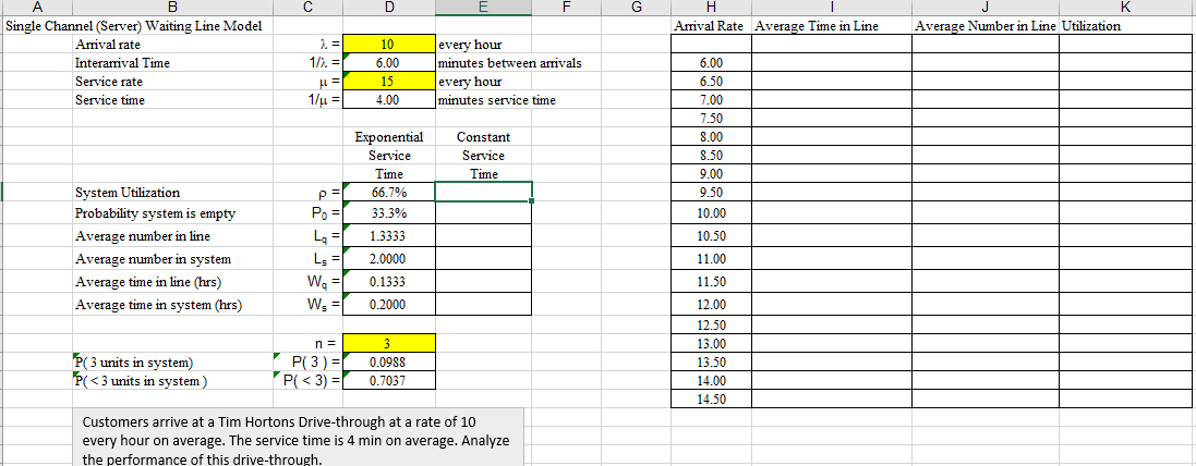
Question: For the first example, please create a chart that shows the increase in average time in line when the arrival rate increases from 5 customers
For the first example, please create a chart that shows the increase in average time in line when the arrival rate increases from 5 customers per hour to 14 customers per hour (increments will be half an hour). You will have to create a data table (What-if Analysis -> Data Table) Comment on your findings in a textbox. SHOW ALL WORK FOR EXCEL
Step by Step Solution
There are 3 Steps involved in it
1 Expert Approved Answer
Step: 1 Unlock

Question Has Been Solved by an Expert!
Get step-by-step solutions from verified subject matter experts
Step: 2 Unlock
Step: 3 Unlock