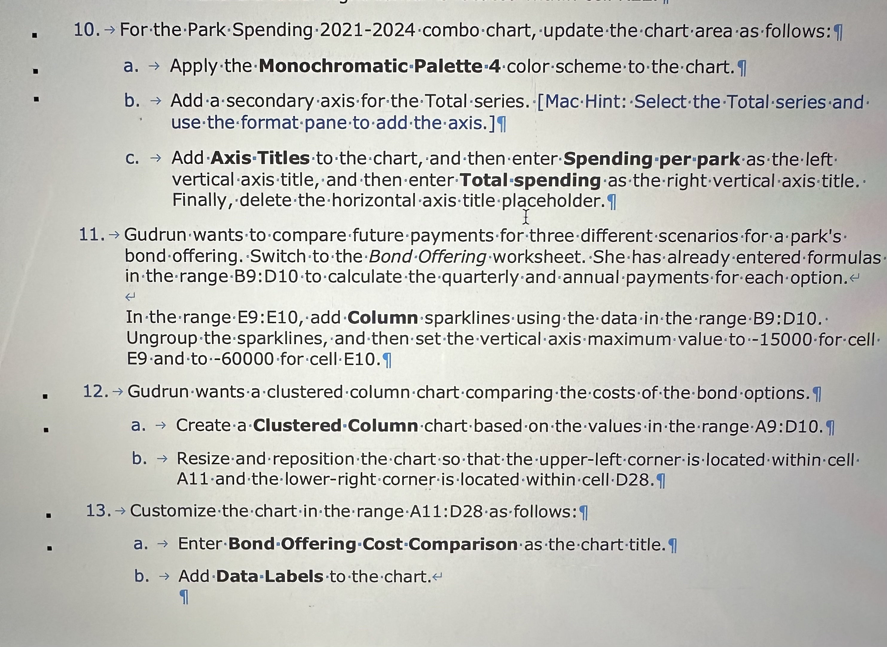
Question: For the Park Spending 2 0 2 1 - 2 0 2 4 combo chart, update the chart area as follows: uarr a . Apply
For the Park Spending combo chart, update the chart area as follows: uarr
a Apply the Monochromatic Palette color scheme to the chart. I use the format pane to add the axis. In
c Add Axis 'Titles to the chart, and then enterSpending per park as the left vertical axis title, and then enterTotalspending as the rightverticalaxis title. Finally, deletethehorizontal saxistitleplaceholder In
Gudrun wants to 'compare future payments for three different scenarios for a park's bond offering. 'Switch to the Bond 'Offering 'worksheet. She has already entered formulas in the rangeB:D to calculate the quarterly and annual payments for each option.
In the range E:E add Column sparklines using the data in the rangeB:D Ungroup the sparklines, and then set the vertical axis maximum value to for cell
Gudrun wants a clustered column chart comparing the costs of the bond options. I
a Createa Clustered Column chart based on the values in the rangeA:D I
b Resize and reposition the chart so that the upperleft corner is located within cell A and the lowerright corner is ocated within cellD II
Customize the chart in the rangeA:Dasfollows:
a EnterBondOffering CostComparison as the charttitle
b Add Data:Labels to the chart.
I

Step by Step Solution
There are 3 Steps involved in it
1 Expert Approved Answer
Step: 1 Unlock


Question Has Been Solved by an Expert!
Get step-by-step solutions from verified subject matter experts
Step: 2 Unlock
Step: 3 Unlock


