

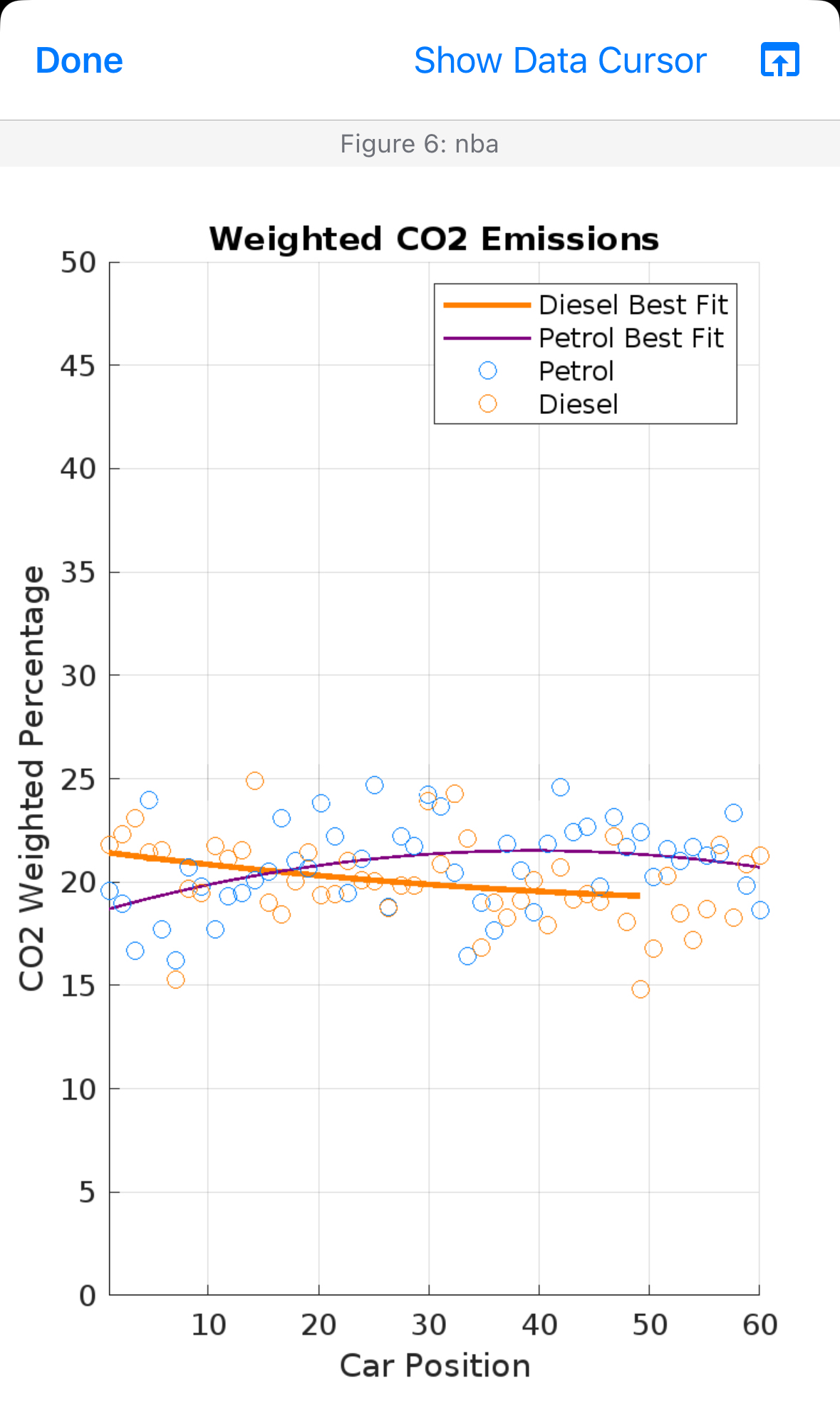
Question: for the y axis could you make it go up by 0 , 1 0 , 2 0 , 3 0 , 4 0 ,
for the y axis could you make it go up by and could you make the blue and orange circles a bit more spread out around the graph. When i use this code i keep getting the graph that you see in the picture everything is fine i just nees the y axis to go up by s starting at and ending at And i need the blue and orange circles to be more spread out. Just fix those two things do not change anything else.
Here is the code to use on matlab :
Set a fixed seed for reproducibilityseed ; Choose any integer value for the seedrngseed; Set the random number generator seed Sample data for Diesel and Petrol carscarPosition linspace; Assumed CO emissions for Diesel and PetrolCODiesel expcarPosition pi randn;COPetrol carPosition pi randn; Fit polynomial curves with a reduced degree of pDiesel polyfitcarPosition CODiesel, ;pPetrol polyfitcarPosition COPetrol, ; Generate points for best fit linesfitDiesel polyvalpDiesel carPositioncarPosition;fitPetrol polyvalpPetrol carPosition; Plotting the datafigure;hold on; Plot Diesel best fit lineplotcarPositioncarPosition fitDiesel, 'Color', 'LineWidth', ; Plot Petrol best fit lineplotcarPosition fitPetrol, 'Color', 'LineWidth', ; Petrol datascattercarPosition COPetrol, o 'MarkerEdgeColor', ; Blue for Petrol Diesel datascattercarPosition CODiesel, o 'MarkerEdgeColor', ; Orange for Diesel Customize the plotxlabelCar Position';ylabelCO Weighted Percentage';titleWeighted CO Emissions';xlim;ylim; Add a legend with custom nameslegendDiesel Best Fit', 'Petrol Best Fit', 'Petrol', 'Diesel'; Add grid linesgrid on;hold off;
Step by Step Solution
There are 3 Steps involved in it
1 Expert Approved Answer
Step: 1 Unlock

Question Has Been Solved by an Expert!
Get step-by-step solutions from verified subject matter experts
Step: 2 Unlock
Step: 3 Unlock