

Question: For this assignment, you will be using the Matplotlib library to graph temperature data for the month of August. Provided for you is a Python
For this assignment, you will be using the Matplotlib library to graph temperature data for the month of August. Provided for you is a Python template to help you get started. You will notice that three arrays are initialized for you already:
xData represents each day of the month and is to be placed on the x-axis
tData is the high temperature for each day
avg is to be the month average up to that day
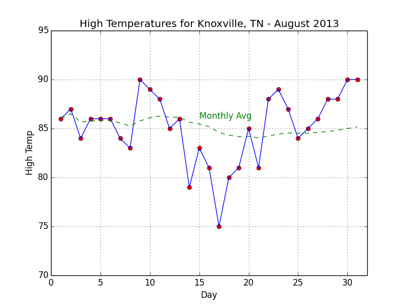
Your task is to compute the monthly average, print a table with your computed values accurate to 2 decimal places, and then plot the high temperatures and month average using Matplotlib. The attached example_output.png provides a screenshot of what the graph should look like. You should try to match it as closely as possible. As for the table, the formatting doesn't particularly matter. To help you match the graph, the template temps-1.py provides a checklist of items that need to be taken care of in the comments. You may consult the Matplotlib documentation for pyplot "http://matplotlib.org/api/pyplot_api.html". to help you carry out the task. Your output table can be simply written to stdout (i.e., to the screen as your script executes).
example_output.png below
temps1.py below
from numpy import arange
import matplotlib.pyplot as plt
xData = arange(1,32) # Ranges for x and y axes must match
tData = [86,87,84,86,86,86,84,83,90,89,88,85,86,79,83,81, \
75,80,81,85,81,88,89,87,84,85,86,88,88,90,90]
avg = [86.] # First value for montly avg high temp is just Day 1 temp
## 1) CALCULATE A RUNNING MONTHLY AVERAGE AND PRINT IT OUT IN A TABLE
## IT DOES NOT MATTER HOW THE TABLE IS FORMATTED
## 2) CREATE A GRAPH FOR THE DATA USING MATPLOTLIB
## - PLOT RED POINTS WITH BLUE LINE FOR ORIGINAL DATA
## - SHOW CHANGE IN AVERAGE HIGH WITH GREEN DASHED LINE
## - SET DISPLAY RANGES FOR X AND Y AXES
## - X SHOULD RANGE FROM 0 TO 32
## - Y SHOULD RANGE FROM 70 TO 95
## - ENABLE GRID DISPLAY
## - LABEL AXES AND SET TITLE
## - USE MATPLOTLIB.PYPLOT.TEXT() TO LABEL THE MONTHLY AVERAGE LINE
plt.show()
High Temperatures for Knoxville, TN August 2013 95 90 Monthly Avg 85 75 70 0 10 15 20 25 30 Day
Step by Step Solution
There are 3 Steps involved in it

Get step-by-step solutions from verified subject matter experts