

Question: For this report, I was given two options either a histogram or a scatter plot and asked to select the one I believe gives the
For this report, I was given two options either a histogram or a scatter plot and asked to select the one I believe gives the best visual for the distribution of points for Celtics between 2013-2015 and Bulls 1996-1998. For that reason, I have selected to use a histogram. Along with showing their dispersion histograms show which values are more and less common. They are also a good way to identify any outliers as we will see in figure 1. I chose the histogram because the number of points scored each year is irrelevant in my opinion. Figure 1 is a better representation of the average points scored and how many times those points were scored.
MY QUESTION: I am second-guessing myself as to whether or not the histogram is the right choice. I am having a hard time describing the below histogram. I can see multiple peak in the histogram for points scored by my team. I can see that there were roughly 28 games where the Celtics scored 98-104 Points. There is an outlier where they scored 128-134 points two times during the time period. What is the best graph to use? How would you describe the graph?
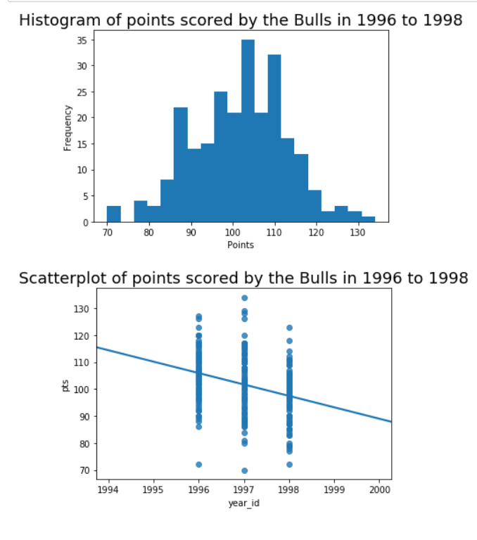
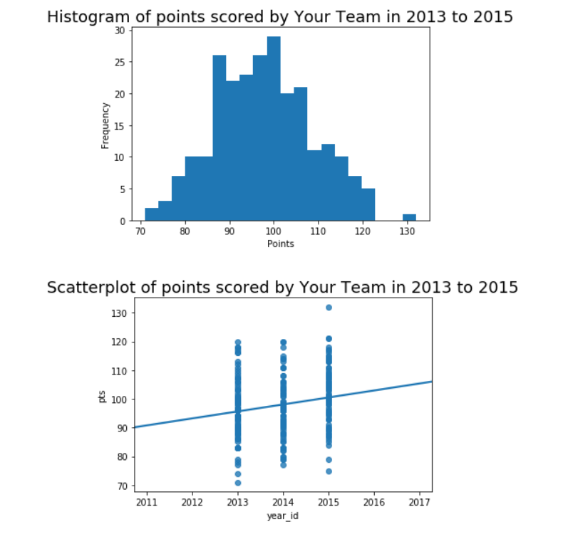
Histogram of points scored by the Bulls in 1996 to 1998 35 30 25 20 Frequency 15 10 5 70 80 90 100 110 120 130 Points Scatterplot of points scored by the Bulls in 1996 to 1998 130 120 110 B 100 90 80 70 1994 1995 1996 1997 1998 1999 2000 year idHistogram of points scored by Your Team in 2013 to 2015 30 25 20 Frequency 15 10 5 70 80 90 100 110 120 130 Points Scatterplot of points scored by Your Team in 2013 to 2015 130 120 110 B 100 90 80 70- 2011 2012 2013 2014 2015 2016 2017 year id
Step by Step Solution
There are 3 Steps involved in it

Get step-by-step solutions from verified subject matter experts