

Question: Gapminder is a foundation, based on Sweden, that aims to enhance basic awareness of basic facts about the socioeconomic global world. As part of
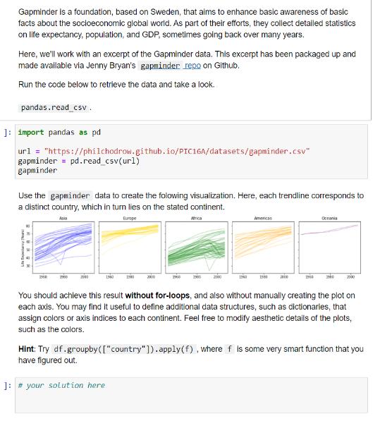
Gapminder is a foundation, based on Sweden, that aims to enhance basic awareness of basic facts about the socioeconomic global world. As part of their efforts, they collect detailed statistics on life expectancy, population, and GDP, sometimes going back over many years. Here, we'll work with an excerpt of the Gapminder data. This excerpt has been packaged up and made available via Jenny Bryan's gapminder repo on Github. Run the code below to retrieve the data and take a look. pandas.read_csv. ]: import pandas as pd url = "https://philchodrow.github.io/PIC16A/datasets/gapminder.csv" gapminder = pd. read_csv(ur1) gapminder Use the gapminder data to create the folowing visualization. Here, each trendline corresponds to a distinct country, which in turn lies on the stated continent. Europe Asio Life Ex Ma: 1960 1900 2000 1960 2000 Americas 1960 1980 xxce 1946 Oceania You should achieve this result without for-loops, and also without manually creating the plot on each axis. You may find it useful to define additional data structures, such as dictionaries, that assign colors or axis indices to each continent. Feel free to modify aesthetic details of the plots, such as the colors. Hint: Try df.groupby( ["country"]).apply(f), where f is some very smart function that you have figured out. ]: # your solution here
Step by Step Solution
There are 3 Steps involved in it
I understand that youd like to create a visualization using the Gapminder data with each trendline c... View full answer

Get step-by-step solutions from verified subject matter experts