Question: HARVARD BUSINESS OPERATIONS MANAGEMENT SIMULATION: QUALITY ANALYTICS PUBLISHING PREPARE ? CHALLENGES: 2 3 7:00 AM Use the sample statistics to calculate the control limits for
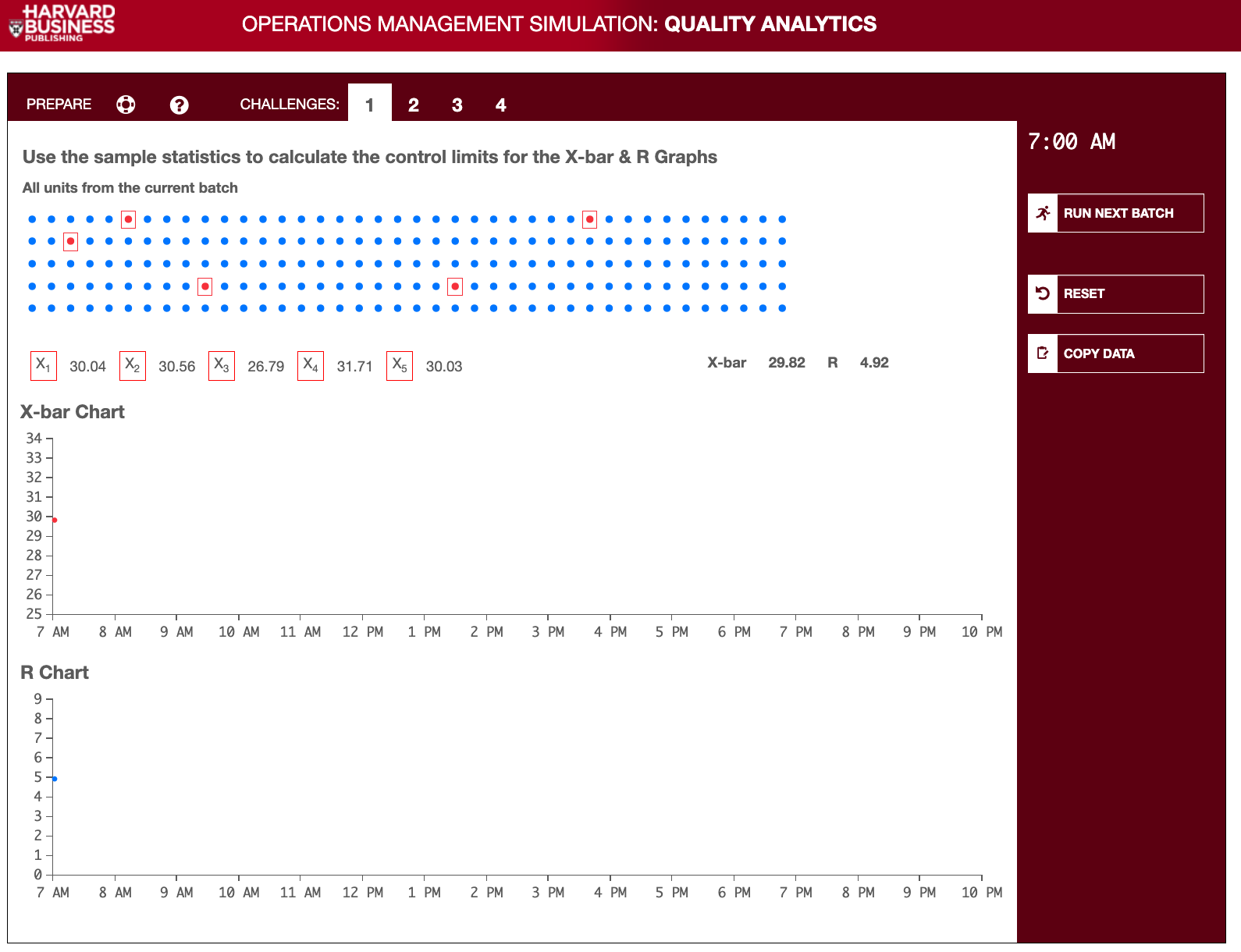
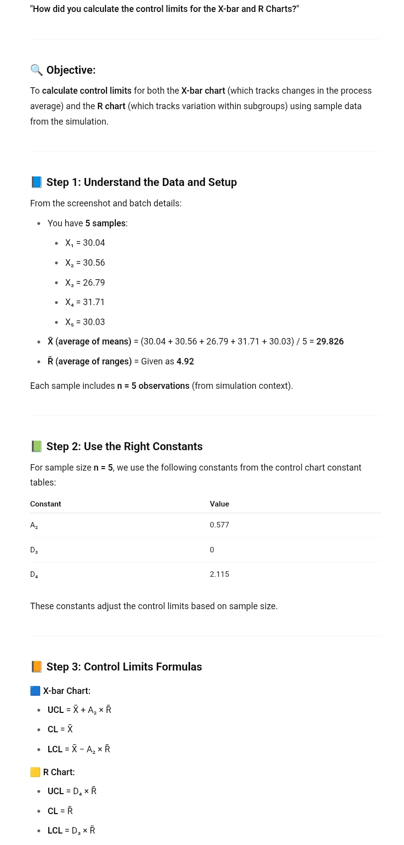
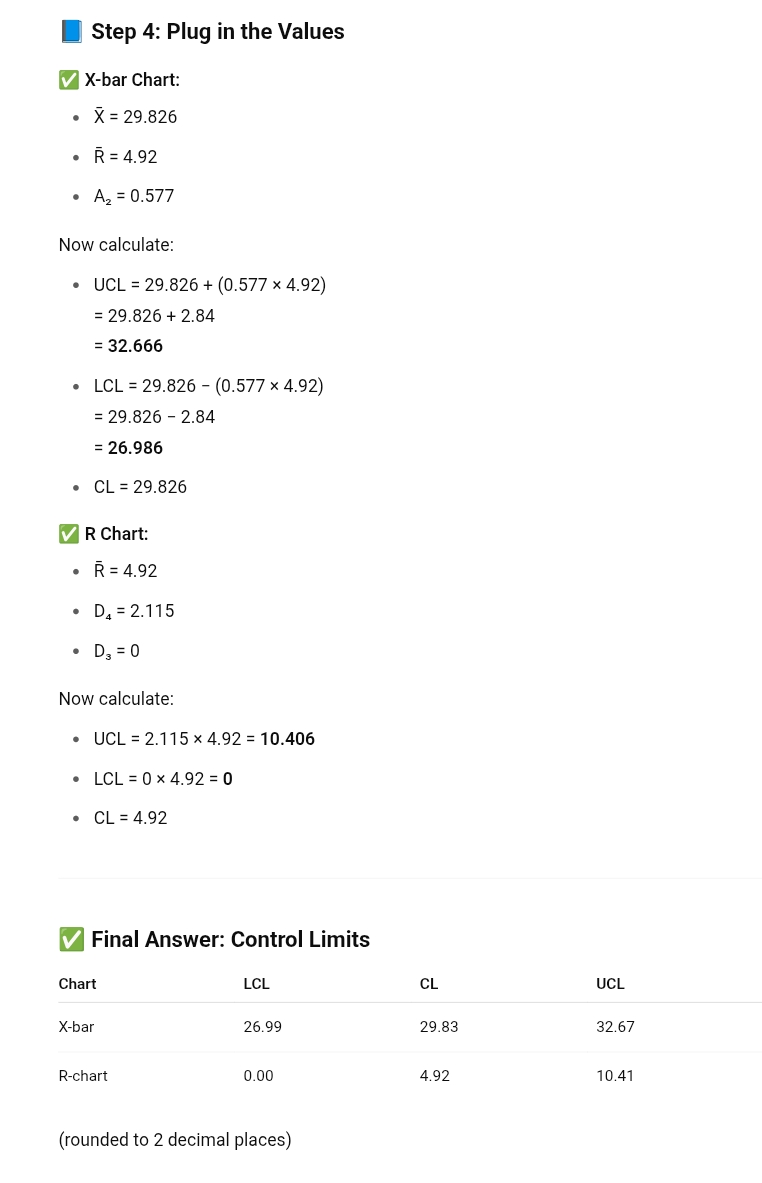
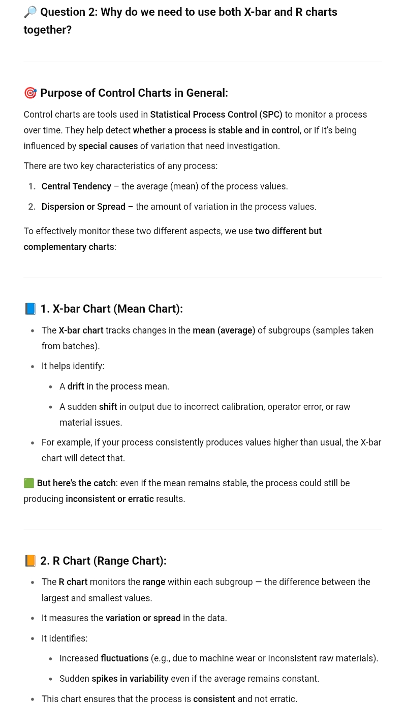
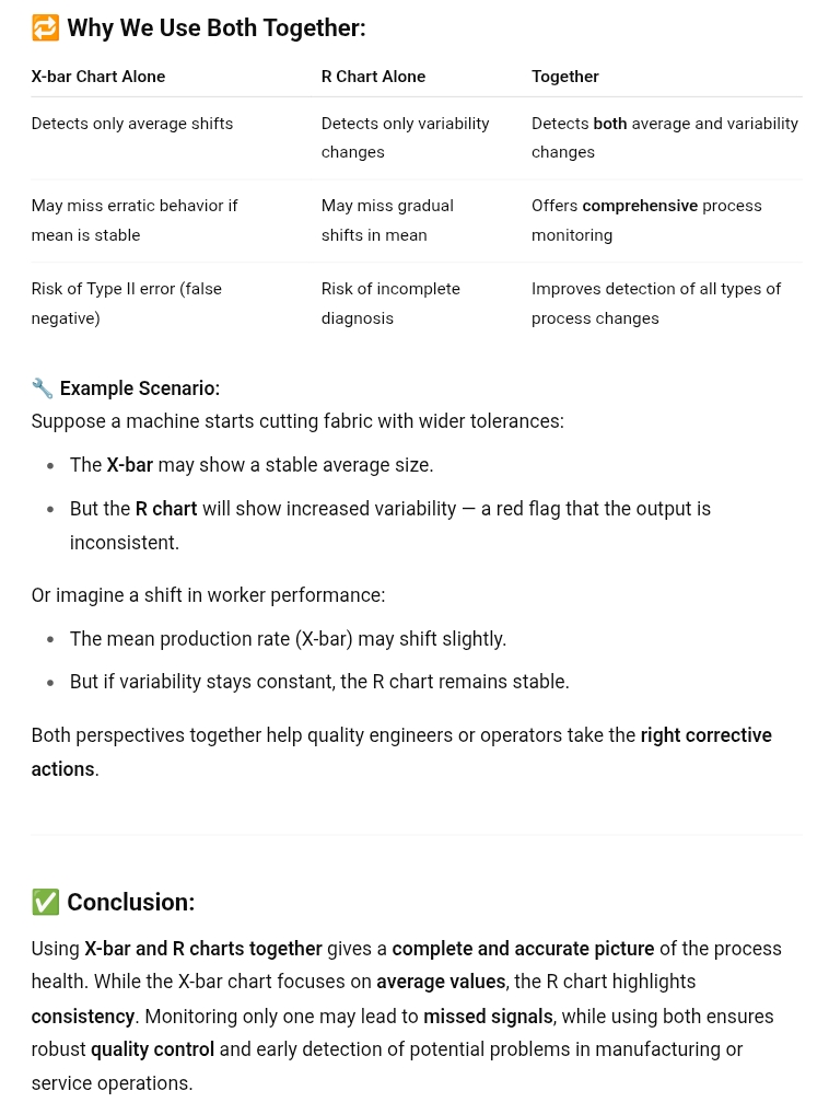
HARVARD BUSINESS OPERATIONS MANAGEMENT SIMULATION: QUALITY ANALYTICS PUBLISHING PREPARE ? CHALLENGES: 2 3 7:00 AM Use the sample statistics to calculate the control limits for the X-bar & R Graphs All units from the current batch RUN NEXT BATCH G RESET X 1 X3 X5 X-bar 29.82 R 4.92 COPY DATA 30.04 X2 30.56 26.79 X4 31.71 30.03 X-bar Chart 34 - 33 - 32 - 31 - 30- 29 - 28 - 27 26 25 7 AM 8 AM 9 AM 10 AM 11 AM 12 PM 1 PM 2 PM 3 PM 4 PM 5 PM 6 PM 7 PM 8 PM 9 PM 10 PM R Chart 8 - 6 - 5- 4 - 3 - 2 - 1 - 0 - 7 AM 8 AM 9 AM 10 AM 11 AM 12 PM 1 PM 2 PM 3 PM 4 PM 5 PM 6 PM 7 PM 8 PM 9 PM 10 PM"How did you calculate the control limits for the X-bar and R Charts?" . Objective: To calculate control limits for both the X-bar chart (which tracks changes in the process average) and the R chart (which tracks variation within subgroups) using sample data from the simulation. i Step 1: Understand the Data and Setup From the screenshot and batch details: You have 5 samples: e X, = 30.04 * X,= 30.56 * X,= 26.79 X,= 31.71 * X,=30.03 X (average of means) = (30.04 + 30.56 + 26.79 + 31.71 + 30.03) / 5 = 29.826 e R (average of ranges) = Given as 4.92 Each sample includes n = 5 observations (from simulation context). |) Step 2: Use the Right Constants For sample size n = 5, we use the following constants from the control chart constant tables: Constant Value Ag 0.577 Ds 0 Dy 2.115 These constants adjust the control limits based on sample size. [) Step 3: Control Limits Formulas @ X-bar Chart: * UCL=X+A,xR * CL=X * LCL=X-A,xR R Chart: * UCL=D,*R Step 4: Plug in the Values V X-bar Chart: . X = 29.826 . R = 4.92 . A2 = 0.577 Now calculate: . UCL = 29.826 + (0.577 x 4.92) = 29.826 + 2.84 = 32.666 . LCL = 29.826 - (0.577 x 4.92) = 29.826 - 2.84 = 26.986 . CL = 29.826 V R Chart: . R = 4.92 . DA = 2.115 . D3 = 0 Now calculate: . UCL = 2.115 x 4.92 = 10.406 . LCL = 0 x 4.92 = 0 . CL = 4.92 V Final Answer: Control Limits Chart LCL CL UCL X-bar 26.99 29.83 32.67 R-chart 0.00 4.92 10.41 (rounded to 2 decimal places)+ Question 2: Why do we need to use both X-bar and R charts together? Purpose of Control Charts in General: Control charts are tools used in Statistical Process Control (SPC) to monitor a process over time. They help detect whether a process is stable and in control, or if it's being influenced by special causes of variation that need investigation. There are two key characteristics of any process: 1. Central Tendency the average (mean) of the process values. 2. Dispersion or Spread the amount of variation in the process values. To effectively monitor these two different aspects, we use two different but complementary charts: 1. X-bar Chart (Mean Chart): e The X-bar chart tracks changes in the mean (average) of subgroups (samples taken from batches). e Ithelps identify: Adrift inthe process mean. Asudden shift in output due to incorrect calibration, operator error, or raw material issues. e For example, if your process consistently produces values higher than usual, the X-bar chart will detect that. )) But here's the catch: even if the mean remains stable, the process could still be producing inconsistent or erratic results. |) 2. R Chart (Range Chart): e The R chart monitors the range within each subgroup the difference between the largest and smallest values. e Itmeasures the variation or spread in the data. * Itidentifies: Increased fluctuations (e.g., due to machine wear or inconsistent raw materials). * Sudden spikes in variability even if the average remains constant. e This chart ensures that the process is consistent and not erratic. =) Why We Use Both Together: X-bar Chart Alone R Chart Alone Together Detects only average shifts Detects only variability Detects both average and variability changes changes May miss erratic behavior if May miss gradual Offers comprehensive process mean is stable shifts in mean monitoring Risk of Type II error (false Risk of incomplete Improves detection of all types of negative) diagnosis process changes \".. Example Scenario: Suppose a machine starts cutting fabric with wider tolerances: e The X-bar may show a stable average size. e But the R chart will show increased variability a red flag that the output is inconsistent. Or imagine a shift in worker performance: e The mean production rate (X-bar) may shift slightly. e Butif variability stays constant, the R chart remains stable. Both perspectives together help quality engineers or operators take the right corrective actions. \"4 Conclusion: Using X-bar and R charts together gives a complete and accurate picture of the process health. While the X-bar chart focuses on average values, the R chart highlights consistency. Monitoring only one may lead to missed signals, while using both ensures robust quality control and early detection of potential problems in manufacturing or service operations
Step by Step Solution
There are 3 Steps involved in it
1 Expert Approved Answer
Step: 1 Unlock
Question Has Been Solved by an Expert!
Get step-by-step solutions from verified subject matter experts
Step: 2 Unlock
Step: 3 Unlock
Students Have Also Explored These Related Mathematics Questions!