

Question: Hello can you please help me with the problem shown below? This table represents the first 8 observations from a sample of 200 individuals, who
Hello can you please help me with the problem shown below?
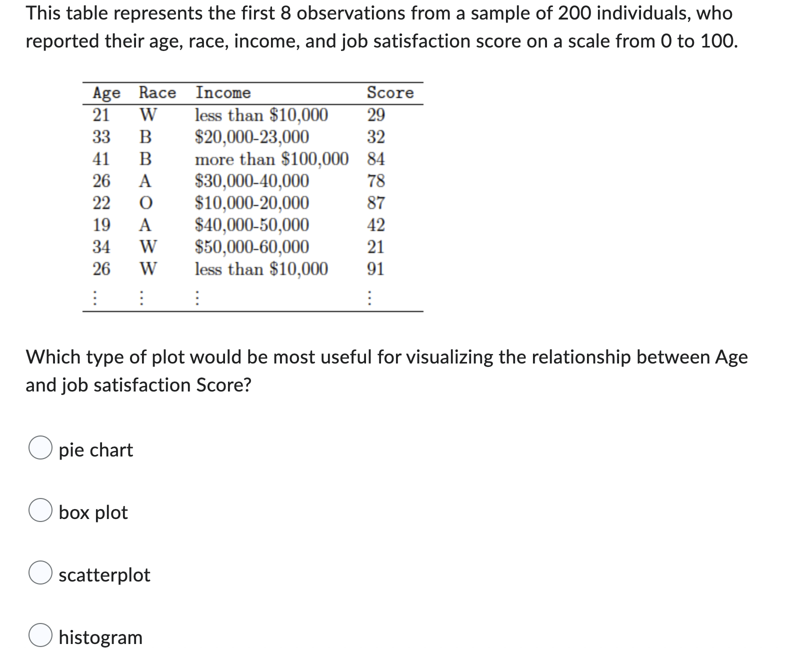
This table represents the first 8 observations from a sample of 200 individuals, who reported their age, race, income, and job satisfaction score on a scale from 0 to 100. Age Race Income Score 21 W less than $10,000 29 33 B 320,000-23,000 32 41 B more than $100,000 84 26 A $30,000-40,000 78 22 O 310,000-20,000 87 19 A $40,000-50,000 42 34 W $50,000-60,000 21 W 26 less than $10,000 91 Which type of plot would be most useful for visualizing the relationship between Age and job satisfaction Score? O pie chart O box plot O scatterplot O histogram
Step by Step Solution
There are 3 Steps involved in it
1 Expert Approved Answer
Step: 1 Unlock

Question Has Been Solved by an Expert!
Get step-by-step solutions from verified subject matter experts
Step: 2 Unlock
Step: 3 Unlock