

Question: Help: paython I need to plot a histogram in anaconda prompt that has y axix with years and x-axis with three bars(NYC population , NYC
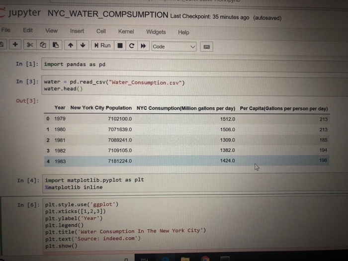
jupyter NYC WATER_COMPSUMPTION Last Checkpoint: 35 minutes ago (autosaved) File Edit View Insert Cell Kernel Widgets Help In [1]: import pandas as pd In [3]: water - pd.read_csv("Water_Consumption.csv") out[3]: water.head () Year 0 1979 1 1980 2 1981 3 1982 4 1983 New York City Population 7102100.0 7071639.0 7089241.0 7109105.0 7181224.0 NYC Consumption(Million gallons per day) 1512.0 1506.0 1309.0 1382.0 1424.0 Per Capita(Gallons per person per day) 213 213 185 194 198 In [4]: import matplotlib.pyplot as pit %matplotlib nline In [6]: plt.style.use('ggplot') plt.xticks ([1,2,3]) plt.ylabel('Year) plt.legend () plt.title('Water Consumption In The New York City') pit.text( 'source: indeed.com') plt.show() jupyter NYC WATER_COMPSUMPTION Last Checkpoint: 35 minutes ago (autosaved) File Edit View Insert Cell Kernel Widgets Help In [1]: import pandas as pd In [3]: water - pd.read_csv("Water_Consumption.csv") out[3]: water.head () Year 0 1979 1 1980 2 1981 3 1982 4 1983 New York City Population 7102100.0 7071639.0 7089241.0 7109105.0 7181224.0 NYC Consumption(Million gallons per day) 1512.0 1506.0 1309.0 1382.0 1424.0 Per Capita(Gallons per person per day) 213 213 185 194 198 In [4]: import matplotlib.pyplot as pit %matplotlib nline In [6]: plt.style.use('ggplot') plt.xticks ([1,2,3]) plt.ylabel('Year) plt.legend () plt.title('Water Consumption In The New York City') pit.text( 'source: indeed.com') plt.show()
Step by Step Solution
There are 3 Steps involved in it

Get step-by-step solutions from verified subject matter experts