

Question: how to create a line graph with this chart in jupyter. pivot values is unemployment percentage and dates are between 2 0 0 5 -
how to create a line graph with this chart in jupyter. pivot values is unemployment percentage and dates are between for each country. my data is tall
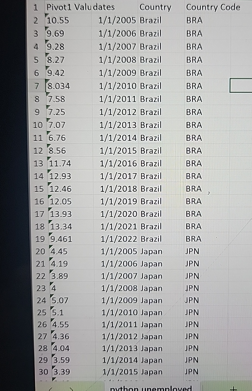
tablePivot Valudates,Country,Country Code Brazil,BRA Brazil,BRA Brazil,BRA Brazil,BRA Brazil,BRA Brazil,BRA Brazil,BRA Brazil,BRA Brazil,BRA Brazil,BRA Brazil,BRA Brazil,BRA Brazil,BRA Brazil,BRA Brazil,BRA Brazil,BRA Brazil,BRA Brazil,BRA Japan,JPN Japan,JPN Japan,JPN Japan,JPN Japan,JPN Japan,JPN Japan,JPN Japan,JPN Japan,JPN Japan,JPN Japan,JPN
Step by Step Solution
There are 3 Steps involved in it
1 Expert Approved Answer
Step: 1 Unlock

Question Has Been Solved by an Expert!
Get step-by-step solutions from verified subject matter experts
Step: 2 Unlock
Step: 3 Unlock