

Question: How to Create a Pie Chart in Excel https://www.youtube.com/watch?v=oS3wNkdyXjA The data described in the link below breaks down Indiana's population by age from the 2016

How to Create a Pie Chart in Excel https://www.youtube.com/watch?v=oS3wNkdyXjA
The data described in the link below breaks down Indiana's population by age from the 2016 census. Use this data in Excel to create pie charts. Turn in the Excel document via this link.
http://www.stats.indiana.edu/
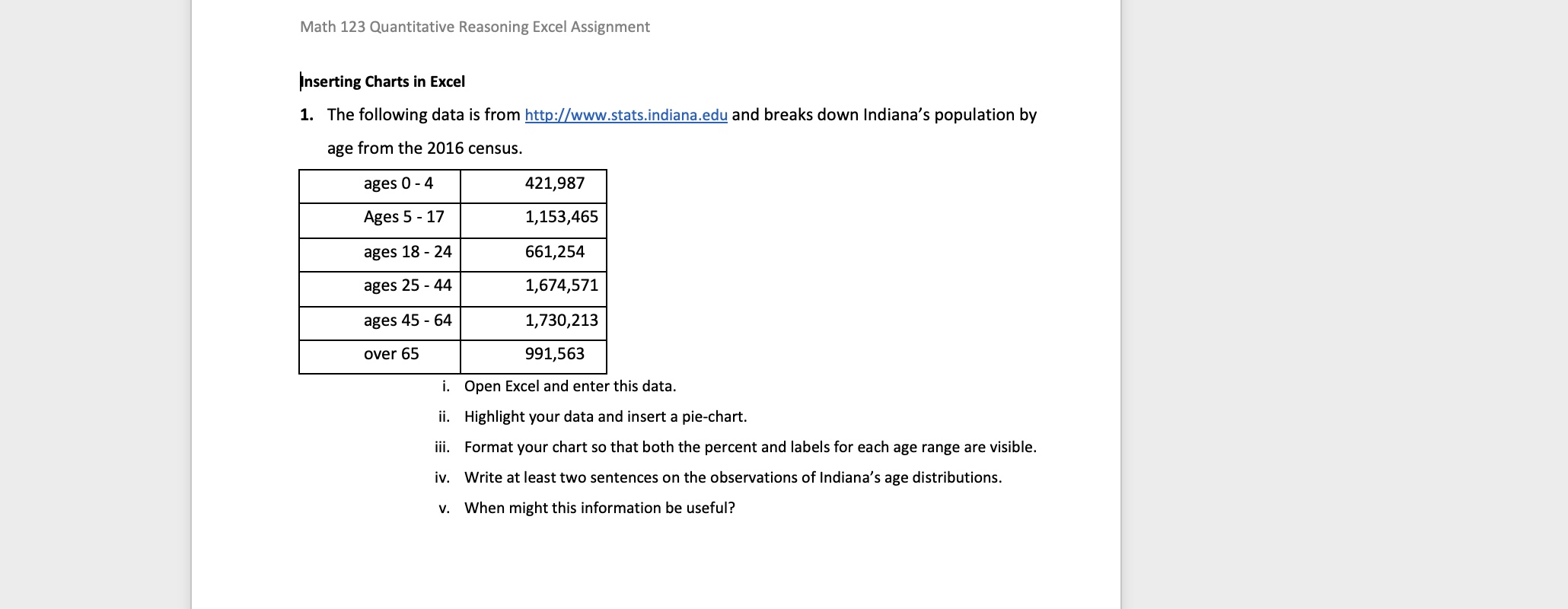
Math 123 Quantitative Reasoning Excel Assignment inserting Charts in Excel 1. The following data is from httg:[zwwwstatsindianaedu and breaks down Indiana's population by age from the 2016 census. ages 0 - 4 421,987 Ages 5 - 17 1,153,465 ages 18 - 24 661,254 ages 25 - 44 1,674,571 ages 45 - 64 1,730,213 over 65 991,563 i. Open Excel and enter this data. ii. Highlight your data and insert a pieschart. iii. Format your chart so that both the percent and labels for each age range are visible. iv. Write at least two sentences on the observations of Indiana's age distributions v. when might this information be useful
Step by Step Solution
There are 3 Steps involved in it

Get step-by-step solutions from verified subject matter experts