

Question: how to plot grey colored vertical bars that span the recession periods? i've already plotted the spread but when i try to plot the recessions
how to plot grey colored vertical bars that span the recession periods? i've already plotted the spread but when i try to plot the recessions my spread llot disappears. HELP please. here is my code 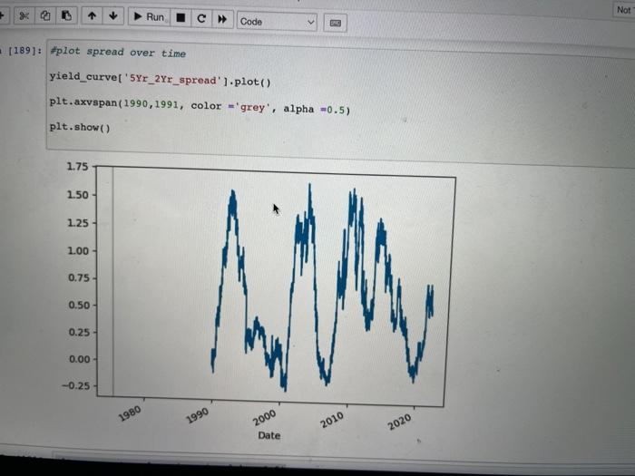
yield_curve['5Yr_2Yr_spread'].plot()
plt.axvspan(1990,1991, color= 'grey', alpha = 0.5
i need both the recession grey area and main plot to show on one graph
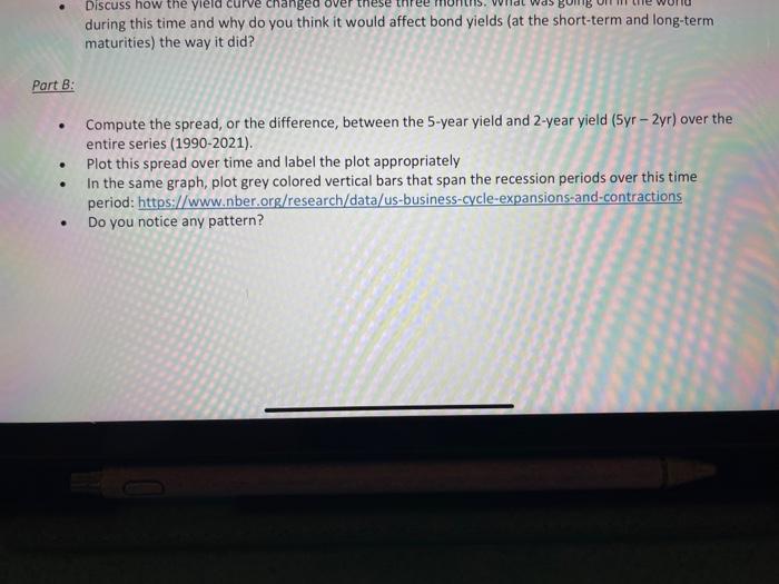
\#plot spread over time yield_curve['5Yr_2Yr_spread'].plot( ) plt.axvspan (1990,1991, color = grey', alpha =0.5) plt. show ( ) during this time and why do you think it would affect bond yields (at the short-term and long-term maturities) the way it did? Part B: - Compute the spread, or the difference, between the 5-year yield and 2 -year yield (5yr - 2yr) over the entire series (1990-2021). - Plot this spread over time and label the plot appropriately - In the same graph, plot grey colored vertical bars that span the recession periods over this time period: https://www.nber.org/research/data/us-business-cycle-expansions-and-contractions - Do you notice any pattern Step by Step Solution
There are 3 Steps involved in it
1 Expert Approved Answer
Step: 1 Unlock

Question Has Been Solved by an Expert!
Get step-by-step solutions from verified subject matter experts
Step: 2 Unlock
Step: 3 Unlock