

Question: How to solve Use Excel to prepare an appropriate type of chart ( bar , line, pie, scatter ) to display the following data. Modify
How to solve Use Excel to prepare an appropriate type of chart bar line, pie, scatter to display the following data. Modify the default colors, fonts, etc., as you judge appropriate to make the display effective. b Would more than one kind of display be acceptable? Why or why not?
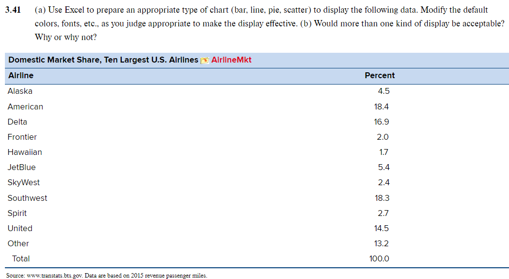
Domestic Market Share, Ten Largest US Airlines AirlineMkt
Airline
Percent
Alaska
American
Delta
Frontier
Hawaiian
JetBlue
SkyWest
Southwest
Spirit
United
Other
Total
a Use Excel to prepare an appropriate type of chart bar line, pie, scatter to display the following data. Modify the default colors, fonts, etc., as you judge appropriate to make the display effective. b Would more than one kind of display be acceptable? Why or why not?
tableDomestic Market Share, Ten Largest US Airlines AirlineMkt,AirlinePercentAlaskaAmericanDeltaFrontierHawaiianJetBlueSkyWestSouthwestSpiritUnitedOtherTotal
Source:
wwwtranstats.btsgov. Data are based on revenue passenger miles.
Step by Step Solution
There are 3 Steps involved in it
1 Expert Approved Answer
Step: 1 Unlock

Question Has Been Solved by an Expert!
Get step-by-step solutions from verified subject matter experts
Step: 2 Unlock
Step: 3 Unlock