

Question: HTML + css . please follow the Instructions below 1. Write the HTML5 source code corresponding to the given web page. Use media queries to
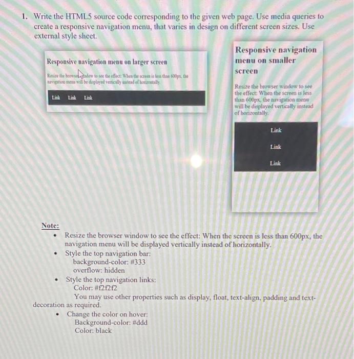
1. Write the HTML5 source code corresponding to the given web page. Use media queries to create a responsive navigation menu, that varies in design on different sereen sizes. Use external style sheet. Note: - Resize the browser window to see the effect: When the screen is less than 600px, the navigation menu will be displayed vertically instead of horizontally. - Style the top navigation bar: background-color: #333 overflow: hidden - Style the top navigation links: Color: \#fif2f2 You may use other properties such as display, float, text-align, padding and textdecoration as required. - Change the color on hover: Background-color: \#ddd Color: black
Step by Step Solution
There are 3 Steps involved in it

Get step-by-step solutions from verified subject matter experts
 Study Help