

Question: I have a csv: direction frequency strength 0 0 278 2.91 1 22.5 178 2.91 2 45 231 3.62 3 67.5 588 4.61 4 90
I have a csv:
| direction | frequency | strength | |
| 0 | 0 | 278 | 2.91 |
| 1 | 22.5 | 178 | 2.91 |
| 2 | 45 | 231 | 3.62 |
| 3 | 67.5 | 588 | 4.61 |
| 4 | 90 | 633 | 3.58 |
| 5 | 112.5 | 360 | 3.67 |
| 6 | 135 | 296 | 3.52 |
| 7 | 157.5 | 357 | 4.64 |
| 8 | 180 | 469 | 5.08 |
| 9 | 202.5 | 546 | 4.73 |
| 10 | 225 | 436 | 4.02 |
| 11 | 247.5 | 300 | 3.63 |
| 12 | 270 | 281 | 3.72 |
| 13 | 292.5 | 290 | 3.19 |
| 14 | 315 | 200 | 3.76 |
| 15 | 337.5 | 222 | 3.07 |
"direction" suggests the wind direction angle (0 means North).
"frequency" suggests the concentration of something.
"strength" suggests the wind speed.
May I know how can I make a plot like these two:
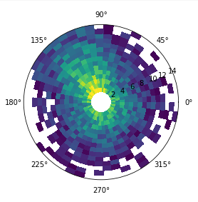
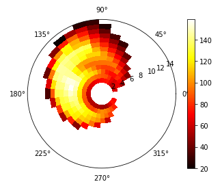
with speed and direction being plotted and the concentration suggesting the color map!
I'll thumbs up, thanks!
Step by Step Solution
There are 3 Steps involved in it
1 Expert Approved Answer
Step: 1 Unlock

Question Has Been Solved by an Expert!
Get step-by-step solutions from verified subject matter experts
Step: 2 Unlock
Step: 3 Unlock