

Question: I need a step by step on how to make a pivot table with red borders look similar to the pivot table on the right
I need a step by step on how to make a pivot table with red borders look similar to the pivot table on the right with blue borders. Please help.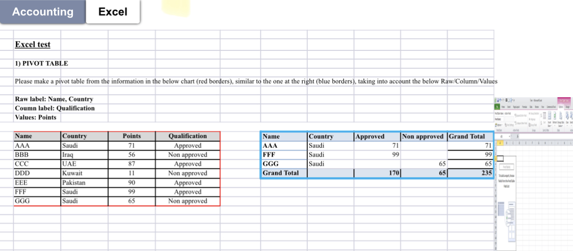
Accounting Excel Excel test 1) PIVOT TABLE Please make a pivot table from the information in the below chart (red borders), similar to the one at the right (blue borders), taking into account the below Raw/Column/Values Raw label: Name, Country Coumn label: Qualification Values: Points \begin{tabular}{|l|l|c|c|} \hline Name & Country & Points & Qualification \\ \hline AAA & Saudi & 71 & Approved \\ \hline BBB & Iraq & 56 & Non approved \\ \hline CCC & UAE & 87 & Approved \\ \hline DDD & Kuwait & 11 & Non approved \\ \hline EEE & Pakistan & 90 & Approved \\ \hline FFF & Saudi & 99 & Approved \\ \hline GGG & Saudi & 65 & Non approved \\ \hline \end{tabular} Accounting Excel Excel test 1) PIVOT TABLE Please make a pivot table from the information in the below chart (red borders), similar to the one at the right (blue borders), taking into account the below Raw/Column/Values Raw label: Name, Country Coumn label: Qualification Values: Points \begin{tabular}{|l|l|c|c|} \hline Name & Country & Points & Qualification \\ \hline AAA & Saudi & 71 & Approved \\ \hline BBB & Iraq & 56 & Non approved \\ \hline CCC & UAE & 87 & Approved \\ \hline DDD & Kuwait & 11 & Non approved \\ \hline EEE & Pakistan & 90 & Approved \\ \hline FFF & Saudi & 99 & Approved \\ \hline GGG & Saudi & 65 & Non approved \\ \hline \end{tabular}
Step by Step Solution
There are 3 Steps involved in it

Get step-by-step solutions from verified subject matter experts