

Question: I only need help with question 3 please. I put the first 2 questions as a reference. Thank you in advance. Q1) This is question
I only need help with question 3 please. I put the first 2 questions as a reference. Thank you in advance.
Q1) This is question #5 Entrepreneur magazine ranks franchises in your textbook. Use this data Franchises.xlsx download
These data can be found in the file Franchises. Create a PivotTable or use JMP Tabulate to summarize these data using classes 09,999, 10,00019,999, 20,00029,999, 30,00039,999 to answer the following questions. (Hint: Use Number of U.S. Locations as the COLUMNS, and use Count of Number of U.S. Locations as the VALUES in the PivotTable.)
- How many franchises have between 0 and 9,999 locations?
- How many franchises have more than 30,000 locations?
Note: you will need to create a new column in JMP and add categories for # of franchise locations as specified in the instructions. Follow these steps :
- Open the franchise data in JMP
- Click on the # US Locations column to select it.
- Click the col tab, then click recode. This will launch a dialogue window for you to create the new categories.
- Change the name of the new column to (USLocCat).
- Note that the values have been ordered from smallest to largest.
- Select the values that are part of the first category 0-9999
- Right-click the selected area, then select 'Group to new Value)
- In the dialogue window that opens, type the category 0-9999, then click Ok.
- In the dialogue window that opens next, click Yes.
- Repeat steps 6 to 8 to create the remaining categories.
- Then click Recode.
- You should have the new variable with the recoded categories in your data.
- Use Analyze ---Tabulate to get the frequency for the categories you created.
Q2 This is Q # 9 in your textbook. You will Use the Scatter.xlsx download
-
Create a scatter chart for these 20 observations.
-
Fit a linear trendline to the 20 observations. What can you say about the relationship between the two quantitative variables?
- Use the steps we used in class for Q4,5,& 6 ( JMP Fit Y by X) for the Case assignment to complete Question 2.
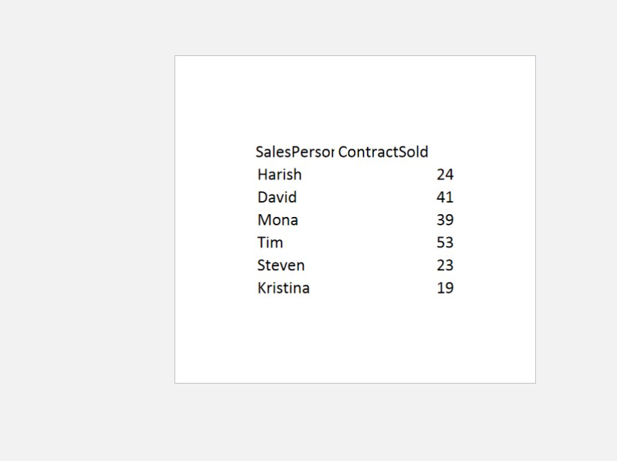
Q3. Use Insurance sales dataset for this question. InsuranceSale.xlsx download
- Create a column chart to show the contract sold by each salesperson. Label the axis
- Create a pie chart to show the contract sold by each salesperson.
- Which chart better represents the data visually? Why?
Follow these steps in JMP :
- Select Graph in JMP
- Select Graph builder (This is interactive you can drag and drop the variables)
- Drag Salespersons to the X-axis and Contract sold to the Y-axis
- Select the bar chart type among the list of chart options
- Put your cursor on the Salespersons until you see a hand icon. Then right-click and select the "order by" to change the ordering of the bar. Select "Contractsold" by ascending to change the order to ascending.
- Select Pie chart type to change the chart type.
- On the left pane, select the drop-down of the Label, and select label by value to display the values on the Pie
Step by Step Solution
There are 3 Steps involved in it

Get step-by-step solutions from verified subject matter experts